+  RHDN Forum Archive
|-+  Romhacking
| |-+  ROM Hacking Discussion
| | |-+  Titlescreens: Screenshots & Edits [Constructive Criticism Only]
Pages: 1 ... 45 46 [47] 48 49 ... 52
Author Topic: Titlescreens: Screenshots & Edits [Constructive Criticism Only]  (Read 15 times)
Tauwasser
Guest
« Reply #690 on: November 19, 2010, 08:10:57 am »

Quote from: Jedi QuestMaster on November 19, 2010, 01:51:58 am
Looks like the designation for the color is embedded somewhere within the tile.

Umm, excuse me Captain Obvious, but this is what graphics are all about. Encoding color information... It is this very "designation for the color" which you are altering all along.

Quote from: MegamanX on November 18, 2010, 05:12:47 am
I'm editing the titlescreen for Monster Capsule GB and when I was done doing some work on it, I loaded it into Rew and there was some new problem which wasn't there before.


Your description doesn't match what you did at all... I dug out the original title screen (left) and marked some tiles (right):


Notice how the tiles in the region I outlined in red are getting another palette assigned than the rest of the tiles that make up the word モンスターカプセル. This is evident by the different shade of yellow/brown the red arrow is pointing at. In order for you to employ this seemingly free-to-use space, you will have to find out how the palettes get assigned for the title screen and change the outlined tiles' palette association to the one you want. This is nothing you did "wrong" while overwriting the tiles in Tile Molester, just to clarify.

cYa,

Tauwasser
MegamanX
Guest
« Reply #691 on: November 19, 2010, 08:39:00 am »

After reading what you put Tauwasser, I totally see what's going on now.  It's being assigned the palette for the 'press start' box despite that the tiles I'm using only contain the bottoms of the モンスターカプセル.  None of the press start box is actually in those tiles, but it's being assigned its colors.  Ugh.

Thanks Tauwasser and Jedi I really appreciate the help. 

I got me some workin' to do.
Jedi QuestMaster
Guest
« Reply #692 on: November 19, 2010, 12:57:26 pm »

Quote from: Tauwasser on November 19, 2010, 08:10:57 am
Quote from: Jedi QuestMaster on November 19, 2010, 01:51:58 am
Looks like the designation for the color is embedded somewhere within the tile.

Umm, excuse me Captain Obvious, but this is what graphics are all about. Encoding color information... It is this very "designation for the color" which you are altering all along.
Never mind - I was thinking of something else. Sad This is not the case.
reyvgm
Guest
« Reply #693 on: November 20, 2010, 01:58:49 am »

Quote from: Pennywise on November 18, 2010, 11:33:58 pm


New title screen courtesy of a friend and friend of a friend. Hacking this in was very easy just need to tweak a few things then perfect.

No offense to the artist, but that's no good man Tongue
The a's, e's and o's are drawn different from one another.
Some letters are higher, lower or bigger compared to the rest.
Some of the yellow has spilled outside of the letters.

Here's, what I believe, is a much better title screen. If you do decide to use mine, you don't have to credit me. I don't care about that, just don't use the one you already have!

Kagemusha
Guest
« Reply #694 on: February 08, 2011, 06:55:46 pm »

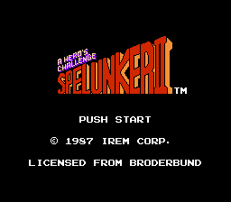
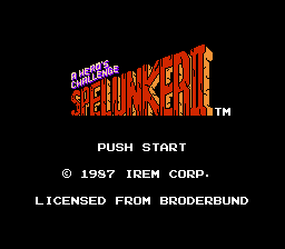
Which title screen should I use?


Azkadellia
Guest
« Reply #695 on: February 08, 2011, 06:58:44 pm »

I like the right one.
justin3009
Guest
« Reply #696 on: February 08, 2011, 08:03:02 pm »

The right one looks better to me.  Adds more character to the letters.
I.S.T.
Guest
« Reply #697 on: February 08, 2011, 10:24:33 pm »

Definitely the right one.
Gideon Zhi
Guest
« Reply #698 on: February 08, 2011, 10:29:21 pm »

The right one is oddly more readable, especially for the more distant letters.
BRPXQZME
Guest
« Reply #699 on: February 08, 2011, 10:57:42 pm »

It kind of bothers me that the first four letters appear to use a different perspective line than the rest. Either way, the one on the right, no question.
Ryusui
Guest
« Reply #700 on: February 09, 2011, 12:11:19 am »

Might as well drop this here, come to think of it.

DarknessSavior
Guest
« Reply #701 on: February 09, 2011, 12:57:02 am »

Quote from: Ryusui on February 09, 2011, 12:11:19 am
Might as well drop this here, come to think of it.


Are you...hacking the GBA version now?

~DS
Ryusui
Guest
« Reply #702 on: February 09, 2011, 01:04:04 am »

Yeppers. More VRAM to play with, for one.

Just FYI, that's the SNES version's logo, gussied up with judicious application of Photoshop filters.
vivify93
Guest
« Reply #703 on: February 12, 2011, 04:54:24 pm »

Quote from: Ryusui on February 09, 2011, 12:11:19 am
Might as well drop this here, come to think of it.

Squee! I'm glad you decided to do the GBA version instead. It's a lot better than the SNES version, let me tell you. This title screen looks very nice and colorful, unlike the US version's bland title. Tongue
Auryn
Guest
« Reply #704 on: March 03, 2011, 01:54:55 am »

I know it's not really the right place to post this but I think this is the place that the most "artists" visit often and I am not in a hurry to get this done.

I am searching an artist that want to design a new title screen for the 4° CD of Final Fantasy 7 International (this is the on game screen):


and here it's the original converted from tim to BMP (512x240@8bits):


For those who can't read japanese, it say "Perfect guide" under Final Fantasy.

Send me a message if u are interested. Thanks
Pages: 1 ... 45 46 [47] 48 49 ... 52  


Powered by SMF 1.1.4 | SMF © 2006-2007, Simple Machines LLC