 Author
|
Topic: Titlescreens: Screenshots & Edits [Constructive Criticism Only] (Read 13 times)
|
Aerdan
Guest
|
 |
« on: January 21, 2007, 09:25:58 am » |
|
As the topic says.
Title-screen screenshots and edits only, please; everything else belongs to either the related thread or the Screenshots thread. If you're going to comment on edits, please try not to sound condescending.
|
|
|
|
|
Spikeman
Guest
|
 |
« Reply #1 on: January 21, 2007, 09:57:47 pm » |
|
Can we post requests here? If so.. While we're here.. anyone want to attempt this title screen?  The first line should say "MegaMan Battle Network", and the second line should say "Real Operation". Here's how one of the other games' title screen got translated:   Note that "MegaMan" is the same in all the games, so you could just take that image and put it as the "MegaMan" part. As for "Battle Network", it varies per game, just try and make it look good. "Real Operation" should be in sort of the same style as the original katakana, and same palette. Anyone up to the challenge? |
|
|
|
|
ghettoyouth
Guest
|
 |
« Reply #2 on: January 22, 2007, 08:25:44 am » |
|
 ok now? some other titlescreens:  my SMB3 hack  my SML2 hack, freezed until MarCas becomes better sprite support  thanks to Racoon Sam for the titlescreen  my 3rd SMW hack, the background was taken from Tales of Phantasia  my 4th SMW hack, features customade graphics only  |
|
|
|
|
creaothceann
Guest
|
 |
« Reply #3 on: January 22, 2007, 09:37:03 am » |
|
 ok now? Yup.  |
|
|
|
|
Maegra
Guest
|
 |
« Reply #4 on: January 22, 2007, 11:44:41 am » |
|
wow that ToP background looks nice, the border you added makes me thing of playing Flashback for some reason @.o
|
|
|
|
|
creaothceann
Guest
|
 |
« Reply #5 on: January 22, 2007, 12:57:50 pm » |
|
Well, Flashback did have jungles with twisted green stuff. |
|
|
|
|
|
|
Gideon Zhi
Guest
|
 |
« Reply #7 on: January 22, 2007, 01:46:01 pm » |
|
|
|
|
|
|
|
|
Ryusui
Guest
|
 |
« Reply #9 on: January 22, 2007, 02:26:59 pm » |
|
  Maybe not very similar to the Japanese title, but I based it off of the official English style of text in the newer games. =/ Beat you to it.  We don't need no stinkin' Taisen! ^_^ EDIT: Oh, and forgot this one:  I actually inserted this into the ROM, though it's a little different from this mock-up...the "2" is a bit further to the left, since I didn't have room to insert it without modifying the tile map. (Yeah, I'm lazy, but the 2 in the OG2 logo also slightly overlaps the letters...) |
|
|
|
|
rmco2003
Guest
|
 |
« Reply #10 on: January 22, 2007, 03:04:58 pm » |
|
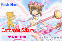
Will anyone have a go at my title screen? I'm not that good with pixel art personally so my attempt is pretty shabby   Here's my half assed attempt:  and here's the uncompressed title screen: http://www.sendspace.com/file/v15k00 |
|
|
|
|
Kajitani-Eizan
Guest
|
 |
« Reply #11 on: January 22, 2007, 04:19:55 pm » |
|
needs moar intermediate colors. you can actually take an actual antialiased font, reduce the number of colors to the ones used by the game, and then tweak it a bit to make sure it looks good. (if you're using ClearType, make sure to switch it to normal antialiasing before you try this.)
generally, if you have a bunch of large text using multiple colors, you want to make use of all of those colors.
i might also go with a slightly less tall, more italic-y font for "card friends". if it can be thicker by a bit, that'd be a plus.
|
|
|
|
|
Ryusui
Guest
|
 |
« Reply #12 on: January 22, 2007, 06:22:55 pm » |
|
On a side note, the subtitle is indeed wrong. The original says "Sakura to Card to Otomodachi", or "Sakura, the Cards and Friends".
Looks to me like you have enough colors in there to just toss out the style of the original logo and adapt Pioneer/Geneon's logo for their subtitled release. And kill the subtitle. Just add the oval with "Sakura Card Chapter" at the bottom.
|
|
|
|
|
rmco2003
Guest
|
 |
« Reply #13 on: January 22, 2007, 06:26:09 pm » |
|
Like I said before I'm not much of a pixel artist, and I would appreciate it if someone could throw together something better for me  |
|
|
|
|
Metal Knuckles
Guest
|
 |
« Reply #14 on: January 22, 2007, 11:16:29 pm » |
|
  Maybe not very similar to the Japanese title, but I based it off of the official English style of text in the newer games. =/ Beat you to it.  We don't need no stinkin' Taisen! ^_^  I actually have a little bit more planned for this then just a translation. I do like your title graphics, though. =P |
|
|
|
|
|
 Author


 thanks to Racoon Sam for the titlescreen


