Jedi QuestMaster
Guest
|
 |
« Reply #675 on: October 26, 2010, 04:31:30 pm » |
|
I Always thought there was something odd about that picture besides her mouth being open to say "BANZAI!" :crazy:
|
|
|
|
|
Moulinoski
Guest
|
 |
« Reply #676 on: October 28, 2010, 04:38:05 pm » |
|
Same reason Nadia’s nose is decidedly situated towards the right side of her face? HAA NOW YOU CAN’T UNSEE IT.
What I can't unsee is your avatar. I keep looking at it... Just laughing at me. Laughing... Laughing... ... |
|
|
|
|
BRPXQZME
Guest
|
 |
« Reply #677 on: October 28, 2010, 05:10:29 pm » |
|
Read all the MS Paint Adventures. All of them. |
|
|
|
|
Moulinoski
Guest
|
 |
« Reply #678 on: October 29, 2010, 08:45:37 pm » |
|
*looks through some of the early ones* ugh. The data structures joke was funny though and relevant. |
|
|
|
|
Kagemusha
Guest
|
 |
« Reply #679 on: November 06, 2010, 08:58:49 pm » |
|
All done.
|
|
|
|
« Last Edit: November 16, 2010, 05:56:05 pm by Pennywise »
|
|
|
|
DarknessSavior
Guest
|
 |
« Reply #680 on: November 06, 2010, 09:44:23 pm » |
|
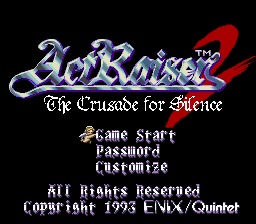
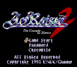
Someone wanna make me a fancy, archaic subtitle for ActRaiser 2?  It says "The Crusade for Silence". Anyone willing to do this yet? >_> ~DS I'll keep quoting myself until someone does this. The only things left are the title screen and script revision. ~DS |
|
|
|
|
Jedi QuestMaster
Guest
|
 |
« Reply #681 on: November 06, 2010, 11:26:37 pm » |
|
I don't know if Azkadellia aproves, but if the "S's" are the only things left standing in your way, here's my little revision:  I don't know how much room you have to work with, though.  \ |
|
|
|
|
sin_batsu
Guest
|
 |
« Reply #682 on: November 06, 2010, 11:32:03 pm » |
|
Hi, I tried to make it fit the original text's size and palette, and I think it's readable. Hope it helps :beer:  |
|
|
|
« Last Edit: November 06, 2010, 11:58:33 pm by sin_batsu »
|
|
|
|
Azkadellia
Guest
|
 |
« Reply #683 on: November 07, 2010, 12:14:34 am » |
|
I don't know if Azkadellia aproves, but if the "S's" are the only things left standing in your way, here's my little revision:  I don't know how much room you have to work with, though.  \ Looks good from here. Nice work. :thumbsup: |
|
|
|
|
DarknessSavior
Guest
|
 |
« Reply #684 on: November 07, 2010, 08:58:57 am » |
|
Thanks, guys. Now I have two titles to work with. If I cannot get the first one to fit, I'll try and work with the second one.  ~DS |
|
|
|
|
MegamanX
Guest
|
 |
« Reply #685 on: November 18, 2010, 05:12:47 am » |
|
I'm editing the titlescreen for Monster Capsule GB and when I was done doing some work on it, I loaded it into Rew and there was some new problem which wasn't there before.  The 'a' was perfectly fine when I did it. When I did the 'p' though, now the color is off on the lower halves of the a and p. I haven't touched any palette stuff or anything like that. Just editing bit-by-bit in TLP. Can anyone shed some light on my problem as I've been working on this screen for a few days because I keep finding thing to nitpick about. Thank you in advance. |
|
|
|
|
Deets
Guest
|
 |
« Reply #686 on: November 18, 2010, 10:23:49 am » |
|
Hi, I tried to make it fit the original text's size and palette, and I think it's readable. Hope it helps :beer:  Now that is what I am talking about. |
|
|
|
|
Kagemusha
Guest
|
 |
« Reply #687 on: November 18, 2010, 11:33:58 pm » |
|
 New title screen courtesy of a friend and friend of a friend. Hacking this in was very easy just need to tweak a few things then perfect. |
|
|
|
|
Jedi QuestMaster
Guest
|
 |
« Reply #688 on: November 19, 2010, 01:51:58 am » |
|
Okay, I see it better now on this monitor. Weird. :huh: Looks like the designation for the color is embedded somewhere within the tile. Have you been playing around with it? Maybe I can give it a shot? :crazy: |
|
|
|
|
MegamanX
Guest
|
 |
« Reply #689 on: November 19, 2010, 05:20:26 am » |
|
All I did was sort out the tiles TLP, number them and started editing them one-by-one in TLP.
When I finish a letter, I load it up into Rew and see how it looks. The a was perfectly fine with it's coloring when I completed it, so then I moved onto the p. I did the p and wasn't happy with it totally, so I worked the bottom half over again. When I was alright with how it looked, I loaded it into Rew and then basically from A until the 60, there's that discoloration and I'm clueless as to why/how.
If you are willing to take a look to help me fix this, I would be grateful. Haven't touched anything else because it's just...annoying me knowing it's not right.
|
|
|
|
|
 Author