 Author
|
Topic: Screenshots (Read 67885 times)
|
Tater Bear
Guest
|
 |
« Reply #2265 on: June 24, 2011, 02:17:08 pm » |
|
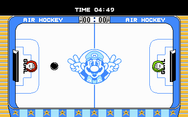
I like this one, but I recommend you go all out if you want to give the game a Mario look. For instance change the hand controlling the paddle to look like Mario's gloved hand (Three lines on the back). Mario paint has is a good example of how his hand looks. The star around the ring need eyes to get that Mario look. Maybe change the palette to make the star's have golden yellow instead of white. If the game has unique colors assigned to the player's paddle you should make them green and red to reflect Luigi and Mario. Proveaux,
If you go with the first one and change the red stripes along the outside to the light blue color, that would open up another color in the pallet.
Going along those lines. It looks like the wood is using the yellow already, which could also be used for the stars. i will see if I can do a sad mock up of the palette changes that i think might work. edit: here is the quick edit. Glove and stars can probably be redraw to look more Mario like. I also change the red stripe as andrewclunn suggested, just to see how it would look.  |
|
|
|
« Last Edit: June 24, 2011, 02:40:52 pm by Tater Bear »
|
|
|
|
Nightcrawler
Guest
|
 |
« Reply #2266 on: June 24, 2011, 02:55:40 pm » |
|
Things are getting interesting... What you're seeing here in this example is an on the fly dump preview. Works the same for insertion. There are many possibilities. Perhaps a logical extension is to allow the translation to be done right in the utility if desired.  |
|
|
|
|
Neil
Guest
|
 |
« Reply #2267 on: June 24, 2011, 03:33:33 pm » |
|
Why is the text only in hover and not in that text box? I'm guessing the properties are sorted alphabetically (end before start?)
Looks good.
|
|
|
|
|
Tater Bear
Guest
|
 |
« Reply #2268 on: June 24, 2011, 03:59:55 pm » |
|
Perhaps a logical extension is to allow the translation to be done right in the utility if desired.
:thumbsup: :crazy: |
|
|
|
|
Proveaux
Guest
|
 |
« Reply #2269 on: June 24, 2011, 04:40:04 pm » |
|
@ Tater Bear. Really like your mock up. Think i will try to implement those changes on gloves, paddles, and stars. :thumbsup:
@andrewclunn. Do you have an idea of something I might should do with an extra color or do you just like the light blue over the red on the bottom? There is a whole extra palette block that, as far as i can tell, isn't being used at all. Black/0F, dark green/19, light green/29, and light blue/31. Which could be changed to what ever colors are needed.
Appreciate the feedback. Really helping me have a better hack.
|
|
|
|
|
andrewclunn
Guest
|
 |
« Reply #2270 on: June 24, 2011, 05:01:00 pm » |
|
The player's icon doesn't really stick out too much as just an outline around white with a white background. Why not use the extra color for that?
|
|
|
|
|
Nightcrawler
Guest
|
 |
« Reply #2271 on: June 24, 2011, 05:02:30 pm » |
|
Why is the text only in hover and not in that text box? I'm guessing the properties are sorted alphabetically (end before start?)
Looks good.
It is in the text box too. I hovered on purpose. As all properties are, it's stuffed in a single line in the text box. Not that readable. They are indeed also alphabetical. The PropertyGrid is a very awesome control for saving time, but it can be a nightmare to change or customize behavior on. Just to make it display hex requires writing a whole TypeConversion class! Later on when objects are finalized, I may move away from it. For now while things are dynamically changing, it works wonders. The actual text will probably move out of there in it's own big text box too. |
|
|
|
|
Proveaux
Guest
|
 |
« Reply #2272 on: June 24, 2011, 06:50:02 pm » |
|
The player's icon doesn't really stick out too much as just an outline around white with a white background. Why not use the extra color for that?
Yeah i cannibalized the original ones to increase the number of free tiles and mostly to be able to fix a glitch. The top row of air hockey table didn't scroll with rest of screen. I'll look into alternate colors. 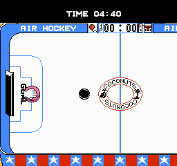 |
|
|
|
|
Tater Bear
Guest
|
 |
« Reply #2273 on: June 24, 2011, 07:55:31 pm » |
|
@ Tater Bear. Really like your mock up. Think i will try to implement those changes on gloves, paddles, and stars. :thumbsup:
Cool   I am pretty sure you can make them work and look mario-esque. I think you have a great idea, so run with it :thumbsup: |
|
|
|
|
Proveaux
Guest
|
 |
« Reply #2274 on: June 24, 2011, 08:14:33 pm » |
|
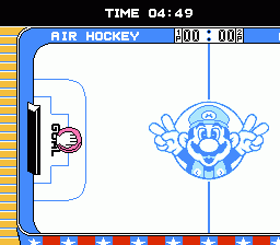
Thanks. Done.  2 screenshots put together  |
|
|
|
|
Jedi QuestMaster
Guest
|
 |
« Reply #2275 on: June 26, 2011, 07:44:32 pm » |
|
Nixon  |
|
|
|
|
MegamanX
Guest
|
 |
« Reply #2276 on: June 26, 2011, 08:42:52 pm » |
|
Nixon  Haha. Glad I'm not the only one who was thinking that. Doesn't look bad, it just reminds me of Nixon is all. |
|
|
|
|
Proveaux
Guest
|
 |
« Reply #2277 on: June 27, 2011, 11:14:43 am » |
|
Lol. Who'd a thunk Mario would end up a Tricky Dicky look a like.  |
|
|
|
|
KingMike
Guest
|
 |
« Reply #2278 on: June 27, 2011, 04:01:29 pm » |
|
Well, he enters the Koopa Kids' castles without permission, robs them blind, then murders them.  |
|
|
|
|
andrewclunn
Guest
|
 |
« Reply #2279 on: June 27, 2011, 06:56:42 pm » |
|
Well, he enters the Koopa Kids' castles without permission, robs them blind, then murders them.  Lies! All lies! |
|
|
|
|
|

 Author


 I am pretty sure you can make them work and look mario-esque. I think you have a great idea, so run with it :thumbsup:
