 Author
|
Topic: Screenshots (Read 67885 times)
|
Nightcrawler
Guest
|
 |
« Reply #2250 on: June 20, 2011, 07:33:18 am » |
|
Agreed. Did you draw that yourself?
|
|
|
|
|
Aerdan
Guest
|
 |
« Reply #2251 on: June 20, 2011, 11:10:58 am » |
|
EDIT: Please try to make sure all image links are not broken by carefully checking and editing the BBCode.
Edit by Moulinoski: Actually, I do that on purpose. Anyone can click on the Quote link and see the original post. No need to fill up the thread with the same pictures.
Except it's far easier for the rest of us to see what the fuck you're smoking talking about when you don't do that. Jerk.  |
|
|
|
|
BRPXQZME
Guest
|
 |
« Reply #2252 on: June 20, 2011, 12:35:46 pm » |
|
Except you’re being passive aggressive about the same guy about trivial stuff every other thread. Is there some  thing you’re not telling us? |
|
|
|
|
Moulinoski
Guest
|
 |
« Reply #2253 on: June 20, 2011, 03:20:51 pm » |
|
Except it's far easier for the rest of us to see what the fuck you're smoking talking about when you don't do that. Jerk.  Against all logic, I'll answer this: You can just scroll up a little bit. :/ Really, not that bad. I leave the pictures there when my post rolls off to a new page, but when it's in the same page, and you can just either scroll up or click the "Quote by" link, I feel it's better I not repost the same pictures in my post. |
|
|
|
|
Aerdan
Guest
|
 |
« Reply #2254 on: June 20, 2011, 03:34:17 pm » |
|
Alternatively, you could maybe trim the quoted images to just the one you're replying to (or just one, really, if you're commenting on the set in general and one in particular stands out for whatever reason). Deliberately breaking the BBCode just makes you look like a dunce and makes it harder for the rest of us to see immediately what you're commenting on. That it's 'just' a matter of scrolling up is irrelevant—there could be a number of other images in posts between yours and what you're replying to, and clicking the 'quote from' link opens a new tab/window which we then have to close before we can respond to you.
So I reiterate: knock it the fuck off.
|
|
|
|
|
rmco2003
Guest
|
 |
« Reply #2255 on: June 20, 2011, 05:54:08 pm » |
|
I wonder if it's possible to automate it via a PHP script? Might be a good idea, it'd save disk space too, although how much it really saves could be negligable, depends if forum posts are stored compressed or not.
|
|
|
|
|
Moulinoski
Guest
|
 |
« Reply #2256 on: June 20, 2011, 06:26:08 pm » |
|
Alternatively, you could maybe trim the quoted images to just the one you're replying to (or just one, really, if you're commenting on the set in general and one in particular stands out for whatever reason). Deliberately breaking the BBCode just makes you look like a dunce and makes it harder for the rest of us to see immediately what you're commenting on. That it's 'just' a matter of scrolling up is irrelevant—there could be a number of other images in posts between yours and what you're replying to, and clicking the 'quote from' link opens a new tab/window which we then have to close before we can respond to you.
So I reiterate: knock it the fuck off.
Except you’re being passive aggressive about the same guy about trivial stuff every other thread. Is there some  thing you’re not telling us? Kiyoshi, your blood pressure must be up through the roof. |
|
|
|
|
Seeeeph
Guest
|
 |
« Reply #2257 on: June 22, 2011, 02:12:27 am » |
|
Quite nice, although I fail to see how there's grass inside a casino. Still cool to see you're still working on this. There's grass only in the lobby. And you're inside a giant ancient pyramid where the modern people use it as a casino. If it still doesn't make any sense, it'll do when you'll see the exterior of the building which will be redone.  That tree looks too realistic for the rest of the scenery, unfortunately—it looks out of place. Now that you mention it, yeah, it might need a bit a tweaking. Especially since it has more colors then anything else around and they clash too much. Gotta admit that it's a REALLY nice looking tree though. Gives me a SoM 2 vibe.
Agreed. Did you draw that yourself?
Well no it comes from ''the spriters resource'' like pretty much all the graphics in the hack. I wouldn't really have time to invest in creating graphics. Hacking the game alone takes forever... Okay maybe not twelve years, but a ton of time and energy to get everything right. I've worked more on the casino itself aswell!    http://www.youtube.com/watch?v=gCtUK3gbcv0 http://www.youtube.com/watch?v=gCtUK3gbcv0 |
|
|
|
|
Proveaux
Guest
|
 |
« Reply #2258 on: June 23, 2011, 05:23:41 am » |
|
After the suggestions I've got these are the 2 I've come up with. Think I'm going to go with the blue ice colored one. Like the colors and the contrast between it and the puck and ref sprite. ✓ New center ice logo  Time for the next on the todo list. 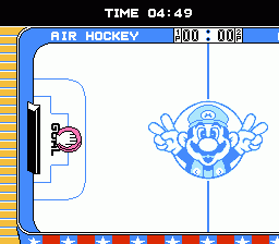 . 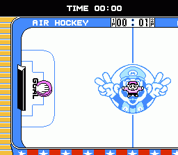 . 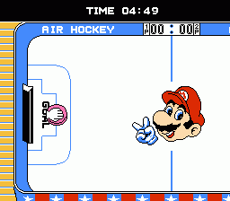 . 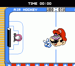 |
|
|
|
|
Gideon Zhi
Guest
|
 |
« Reply #2259 on: June 23, 2011, 12:42:37 pm » |
|
The first one looks a lot more like what you'd expect to find printed on an ice rink. I'd go with that, myself.
|
|
|
|
|
Moulinoski
Guest
|
 |
« Reply #2260 on: June 23, 2011, 05:28:44 pm » |
|
Let's see how this whole "leave-the-pictures-in-the-quote" thing works out in a thread full of pictures. There's grass only in the lobby. And you're inside a giant ancient pyramid where the modern people use it as a casino. If it still doesn't make any sense, it'll do when you'll see the exterior of the building which will be redone. Now that you mention it, yeah, it might need a bit a tweaking. Especially since it has more colors then anything else around and they clash too much. Well no it comes from ''the spriters resource'' like pretty much all the graphics in the hack. I wouldn't really have time to invest in creating graphics. Hacking the game alone takes forever... Okay maybe not twelve years, but a ton of time and energy to get everything right. I've worked more on the casino itself aswell!    http://www.youtube.com/watch?v=gCtUK3gbcv0 http://www.youtube.com/watch?v=gCtUK3gbcv0I see what you mean now with regards to the grass actually just being the outside. Looks good so far. I agree with the tree contrasting too much. I could look for some sprites in The Spriter's Resource that can fit the game whenever I have spare time, if ever. So far, though, good job! Can't wait to play this if it ends up actually being playable (unlike a certain other hack that promised to be great but fell short due a certain sword/shield and saving problem). After the suggestions I've got these are the 2 I've come up with. Think I'm going to go with the blue ice colored one. Like the colors and the contrast between it and the puck and ref sprite. ✓ New center ice logo  Time for the next on the todo list.  .  .  .  I agree with Gideon; the first one looks more natural. Have you tried the second one with a blue color scheme? (You could also make a "red" effect on the blue and see if that works too- ie making the reds light pink). |
|
|
|
|
Celice
Guest
|
 |
« Reply #2261 on: June 23, 2011, 09:24:25 pm » |
|
I say go for the first! It's really pretty that way  Maybe you should try changing the wood on the outer sides of the rink? I personally think it looks jarring from the blue palette of the scene. Maybe try to make an audience rink or something? |
|
|
|
|
Proveaux
Guest
|
 |
« Reply #2262 on: June 23, 2011, 11:01:41 pm » |
|
Thanks Gideon Zhi, Garoth Moulinoski, and Celice. That would be a good idea. Seen that in a few games. Mike tyson's punch out comes to mind. Sadly, if I remember correctly, I used ever empty or unused tile available plus remapped any duplicate ones.
|
|
|
|
|
KingMike
Guest
|
 |
« Reply #2263 on: June 24, 2011, 08:54:25 am » |
|
But it's air hockey, not real hockey. An audience doesn't make sense.  |
|
|
|
|
andrewclunn
Guest
|
 |
« Reply #2264 on: June 24, 2011, 01:53:52 pm » |
|
Proveaux,
If you go with the first one and change the red stripes along the outside to the light blue color, that would open up another color in the pallet.
|
|
|
|
|
|
 Author