 Author
|
Topic: Screenshots (Read 67905 times)
|
DarknessSavior
Guest
|
 |
« Reply #1665 on: March 14, 2010, 06:53:24 pm » |
|
Always gotta try and outdo me, eh Gem? Anyway, yours is for the PSX version, IIRC. Do it on the SNES version. =P Status icons can be moved on the Snes version, too. I was referring to just about everything else you did to that version. I could move the status icons, but there isn't any room for it (as my handedness and the glove item name are on the bottom line) to go where you have it. I might move them somewhere else, though. ~DS |
|
|
|
|
Rai
Guest
|
 |
« Reply #1666 on: March 14, 2010, 09:00:58 pm » |
|
 Successfully expanded the menu's... Now I can fit in those long weapon and item names  . All that's left to do is implement a DTE routine into the menu's text routine. Unlike before, the expanded menu's don't overlap the character you selected. |
|
|
|
|
Zeemis
Guest
|
 |
« Reply #1667 on: March 15, 2010, 12:01:18 am » |
|
My personal favorite is this one (tho the portrait should be relocated), based on both DS and GBA layouts:  Moving those status icons to the bottom helps a lot. I can't tell whether or not this is the DS version with a GBA portrait, or vice versa. o_O; |
|
|
|
|
vivify93
Guest
|
 |
« Reply #1668 on: March 15, 2010, 03:12:30 am » |
|
This one, definitely. It just looks...more pleasing to the eye compared to the others. |
|
|
|
|
Vegetaman
Guest
|
 |
« Reply #1669 on: March 15, 2010, 03:38:58 am » |
|
This one, definitely. It just looks...more pleasing to the eye compared to the others. I have to agree. The faint black shadow makes it highly readable and easy on the eyes. |
|
|
|
|
justin3009
Guest
|
 |
« Reply #1670 on: March 15, 2010, 07:52:31 am » |
|
I'll be thirding with that. Looks absolutely great.
|
|
|
|
|
tc
Guest
|
 |
« Reply #1671 on: March 15, 2010, 10:16:28 am » |
|
Oh wow. Even better if you can pull off the wizardry it takes to get a VWF on NES. |
|
|
|
|
Kajitani-Eizan
Guest
|
 |
« Reply #1672 on: March 15, 2010, 10:32:45 am » |
|
This one, definitely. It just looks...more pleasing to the eye compared to the others. I have to agree. The faint black shadow makes it highly readable and easy on the eyes. |
|
|
|
|
DaMarsMan
Guest
|
 |
« Reply #1673 on: March 19, 2010, 12:13:48 pm » |
|
This one, definitely. It just looks...more pleasing to the eye compared to the others. Any chance you can put a space or - after the icons? It looks bad in my opinion to have them pressed up right against the text like taht. Ideally, a half a space would look best. That could be done via an hdma hack I believe. EDIT: Thanks Gid for pointing out this is NES. |
|
|
|
« Last Edit: March 19, 2010, 12:32:04 pm by DaMarsMan »
|
|
|
|
Karatorian
Guest
|
 |
« Reply #1674 on: March 19, 2010, 08:53:27 pm » |
|
Any chance you can put a space or - after the icons? A space or dash could be added, but it'd be one less character availble for item names, unless I made the menu even wider. I don't want to do that because then I'd have to make the shop title shorter and I'd be unable to fit "Black Magic" or "White Magic" in there. Furthermore, the current length works idealy for my redesigned inventory system. It looks bad in my opinion to have them pressed up right against the text like taht. That's the way FF VI does it and it doesn't look bad. However, the original FF icons do look a little off like that. I plan on updating the icons anyway. Ideally, a half a space would look best. That could be done via an hdma hack I believe. The NES doesn't have HDMA. So, to do a half space, you have to either do tricky scrolling hacks in a complex V-Blank routine (I've written one in a little tech demo), use the same methods used for VWF, or use two tiles and add a half space before the icon as well. The first requires much more invasive changes than even my ambitious plans contemplate. I may someday try hacking VWF support into FF, but it's not an immediate priority. Using two tiles per icon would probably require more tile space than I've got availble at the moment. |
|
|
|
|
DarknessSavior
Guest
|
 |
« Reply #1675 on: March 19, 2010, 08:55:20 pm » |
|
Ignore DMM. That looks great! :beer:
~DS
|
|
|
|
|
KingMike
Guest
|
 |
« Reply #1676 on: March 19, 2010, 10:43:47 pm » |
|
We don't know the skill level of the anonymous hackers, but the Chinese translation of FF (I forget what it was called) was really laggy (possibly because each string had to be drawn to VRAM, unlike a kana or English font that can fit in VRAM and be tile-mapped). Not leaving me with much confidence as to the feasibility of VWF (as I suspect it to be a more labor-intensive process).
|
|
|
|
|
RedComet
Guest
|
 |
« Reply #1677 on: March 20, 2010, 09:54:44 am » |
|
DnD Translations pulled it off for that detective game, so it's possible.
|
|
|
|
|
DarknessSavior
Guest
|
 |
« Reply #1678 on: March 20, 2010, 01:23:06 pm » |
|
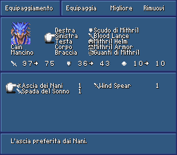
Since I've been doin' all this work on FFIV recently, I figured I would find a save at around the end of the game on the internet, and test to see how things looked. Here's the results:      This showcases the hacked magic screens, and the fact that all of the white/black/summon spells (except for "Thundara", "Thundaga", "Teleport" and "Leviathan") fit. It showcases the newly hacked equipment screen, and some of the various longer names that I can now use for equipment. It also showcases the hacked status screen, and how my hacks do not break anything, even once your stats get into high digits. I do need to find a new way to express 神々ã®å‰£ in English, though. I don't like "Pantheon Sword", which is what Ryusui came up with. "Sword of the Gods" would be fine, but doesn't fit. Thus, "Gods' Sword". It's the best sword in the game, so it needs a badass name. ~DS |
|
|
|
|
Neil
Guest
|
 |
« Reply #1679 on: March 20, 2010, 01:58:58 pm » |
|
Porky? is there also a canadian bacon spell?  seriously though, looks good! although I must admit I do agree with ryusui. gods' sword just doesn't sound badass enough. Take some liberty. Call it something awesome. ryusui's option sounds pretty good. Sword of the Lord or Sword of the Heavens or go for something quasi historical like Heavens Will. |
|
|
|
|
|
 Author


 . All that's left to do is implement a DTE routine into the menu's text routine. Unlike before, the expanded menu's don't overlap the character you selected.


