 Author
|
Topic: Screenshots (Read 67905 times)
|
DarknessSavior
Guest
|
 |
« Reply #1650 on: March 13, 2010, 04:03:53 pm » |
|
I agree. I might actually play the NES Final Fantasy through if you get this fully working with expanded item names and stuff. Why not throw a more updated FF font in it, from like FFIV/VI?
~DS
|
|
|
|
|
Karatorian
Guest
|
 |
« Reply #1651 on: March 13, 2010, 06:50:13 pm » |
|
I agree. I might actually play the NES Final Fantasy through if you get this fully working with expanded item names and stuff. Thanks. Expanded item names should be fairly easy, but time consuming. The items currently use fixed length strings (padded with spaces). I belive space for longer item names could be reclaimed by removing the padding, but it will require updating parts of the engine that expect them to be fixed size. Several places that reference item names don't use the game's standard text routine, so items don't use DTE either. Why not throw a more updated FF font in it, from like FFIV/VI? I'll have to think about that. I've actually contemplated doing variable width, but I haven't fully evaluted what would be involved. The issue would be various parts of the game that don't use the standard text routine. I'd have to either change them to use the routine or make sure I don't break them in any case. |
|
|
|
|
DarknessSavior
Guest
|
 |
« Reply #1652 on: March 13, 2010, 07:32:06 pm » |
|
Fixed-length is fine. It's just the NES FF1 font looks outdated, and kinda bad, compared to the SNES versions.
~DS
|
|
|
|
|
Karatorian
Guest
|
 |
« Reply #1653 on: March 14, 2010, 09:15:05 am » |
|
Fixed-length is fine. It's just the NES FF1 font looks outdated, and kinda bad, compared to the SNES versions. Well, I know variable width's overkill, but it'd be a interesting. Plus I've wanted to do one ever since I read KingMike's doc about it, but I haven't yet. In the mean time, here's a bunch of fixed width:    These three are SNES era Final Fantasy fonts. The first two are a custom font that claims to have the selected the best charaters from various SquareSoft fonts (with black and grey shadows). The third is from FFVI, it had icons, so I included them too. I adjusted the window border slightly, as the original border looked to tight on top.    This set is the font from the GBA port. The first two are the orignal with black and grey shadows. The third one is modifed with two tone shading, ostensibly so it looks better at fixed width. One thing I'v always liked about this font is the text figures (lower case numerals). However, it's clearly designed for variable width, which shows pretty badly with some letter combinations. (Perhaps I can adjust the kerning a bit. Hmm.) These ones also include a less obtrusive window border that I feel matches a condensed font better.    These three are non Final Fantasy fonts. The fist one is a modified Dragon Quest font. It's pretty meh. The second one is more interesting. It even included it's own border. I like the font, but the lack of proper lower case is a dissapointment and the border is too busy for my taste. The half-tone background is pretty cool and I might steal the idea. The last one is a font I designed (for no paticular reason) named "chunky". As you can see, it's extra black. I'm not serious about using this one, but I haven't done much with it, so I threw it in for kicks. I grabbed a few more fonts to try out, but I haven't gotten around to it yet. As is, I delayed the real work messing with these. |
|
|
|
|
DarknessSavior
Guest
|
 |
« Reply #1654 on: March 14, 2010, 10:13:22 am » |
|
I like the first (looks like FFIV) and sixth (looks like Dragonsbrethren's FF Advance font) ones. :thumbsup: Edit: Since we're on FF modifications, here's one of my own (for FFIV). When I increased the item name limit, the only real problem I ran into (other than the need to redo the Item Menu) was when a character would equip an arrow, the counter for how many arrows left would be stored in the middle of the item name. I've changed that:  I could either make it above or below the arrow name. I think above looks better. And keep in mind it's only there when you use arrows, obviously. ~DS |
|
|
|
« Last Edit: March 14, 2010, 10:32:25 am by DarknessSavior »
|
|
|
|
GenoBlast
Guest
|
 |
« Reply #1655 on: March 14, 2010, 12:17:09 pm » |
|
It's pretty meh.  |
|
|
|
|
KingMike
Guest
|
 |
« Reply #1656 on: March 14, 2010, 01:23:06 pm » |
|
I like the first (looks like FFIV) and sixth (looks like Dragonsbrethren's FF Advance font) ones. :thumbsup: Edit: Since we're on FF modifications, here's one of my own (for FFIV). When I increased the item name limit, the only real problem I ran into (other than the need to redo the Item Menu) was when a character would equip an arrow, the counter for how many arrows left would be stored in the middle of the item name. I've changed that:  I could either make it above or below the arrow name. I think above looks better. And keep in mind it's only there when you use arrows, obviously. ~DS If there's a choice, I say below. Looks more natural (like how I've seen games that print prices/quantities below item names, but I can't name one that printed it above). |
|
|
|
|
DarknessSavior
Guest
|
 |
« Reply #1657 on: March 14, 2010, 02:40:45 pm » |
|
There is a choice. Ask and thou shalt receive:  Anyone else have a preference? I can pretty much move that number anywhere I want within the three or so lines surrounding the RHand stuffs. ~DS |
|
|
|
|
Karatorian
Guest
|
 |
« Reply #1658 on: March 14, 2010, 05:22:58 pm » |
|
It's pretty meh.  Hey, no offence intended. It's not a bad font (much better than my "chunky" for most usages), it's just that I'm not sure in this case it's much of an improvement over the orginal Final Fantasy font. I suppose it looses out for lack of drop shadows, which would be easy enough to add. I just compared it to the source, and it's quite an improvement. I like the first (looks like FFIV)... It's been a while since I played IV. Good game. ...and sixth (looks like Dragonsbrethren's FF Advance font) ones. It is. Now I just need to pick one, hmm. Since we're on FF modifications, here's one of my own (for FFIV). When I increased the item name limit, the only real problem I ran into (other than the need to redo the Item Menu) was when a character would equip an arrow, the counter for how many arrows left would be stored in the middle of the item name. Hey, that's pretty cool. Anyway, time to stop messing with fonts and get back to hacking ASM =_= |
|
|
|
|
DarknessSavior
Guest
|
 |
« Reply #1659 on: March 14, 2010, 05:25:53 pm » |
|
I was talking to Kitsune Sniper and he did a mockup of an idea, tell me what you think of it:  I think this would easily be possible. It would give me a TON more space for item names. I'd have to leave the arrow count at the edge of the line and hope no arrow names take up THAT much space, but still. Or I could move it up a line back to where it was (moving it down another line would be alot more difficult. Just trust me. I've already looked into it). I could also fit "Right Hand" and "Left Hand" if I did that. ~DS |
|
|
|
« Last Edit: March 14, 2010, 06:40:16 pm by DarknessSavior »
|
|
|
|
Tauwasser
Guest
|
 |
« Reply #1660 on: March 14, 2010, 05:49:52 pm » |
|
Does it have to be only half the screen height? You could do lots of other cool stuff by resizing it to be full screen height.
cYa,
Tauwasser
|
|
|
|
|
DarknessSavior
Guest
|
 |
« Reply #1661 on: March 14, 2010, 06:02:55 pm » |
|
Does it have to be only half the screen height? You could do lots of other cool stuff by resizing it to be full screen height.
cYa,
Tauwasser
I think it does. That half of the screen is for when you choose equipment to put on. ~DS |
|
|
|
|
Gemini
Guest
|
 |
« Reply #1662 on: March 14, 2010, 06:06:48 pm » |
|
My personal favorite is this one (tho the portrait should be relocated), based on both DS and GBA layouts:  Moving those status icons to the bottom helps a lot. |
|
|
|
|
DarknessSavior
Guest
|
 |
« Reply #1663 on: March 14, 2010, 06:12:13 pm » |
|
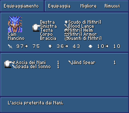
Always gotta try and outdo me, eh Gem? Anyway, yours is for the PSX version, IIRC. Do it on the SNES version. =P Also, you're going to get something that you wanted. I'm having to re-arrange the shop menus to get the equipment thing to work (expanding the item-length covered up the damned prices anyway! So I had to move the items one row up!). Edit: So here it is, folks. New and improved item names in the equip menu and shops:    I am now able to use item names that are up to 15 characters long (none of the current names are final)! Edit2: I've thrown in an item shop for extra mind-blowage. However, I am left with ONE bug. It is quite fixable, and involves doing something I was planning on doing ANYWAY (expanding the item menu to allow for bigger item names):  Again, extra props to Kitsune Sniper for inspiration. ~DS |
|
|
|
« Last Edit: March 14, 2010, 06:40:05 pm by DarknessSavior »
|
|
|
|
Gemini
Guest
|
 |
« Reply #1664 on: March 14, 2010, 06:51:07 pm » |
|
Always gotta try and outdo me, eh Gem? Anyway, yours is for the PSX version, IIRC. Do it on the SNES version. =P Status icons can be moved on the Snes version, too. |
|
|
|
|
|
 Author


