 Author
|
Topic: Screenshots (Read 67911 times)
|
aishsha
Guest
|
 |
« Reply #1065 on: March 09, 2009, 09:45:43 am » |
|
I honestly think Seta games were just under-valued 'cause I was really surprised to see the depth of their titles. You can even look at the monster list which is taken directly from Hindu mythology and mercenary system works really good. The thing is that their games are crap to work with - I have Silva Saga 1 completely ready in terms of text but technical issues do not allow releasing that at the moment...And Minelvaton - it's a total mess where text goes directly inside the code  |
|
|
|
|
Nightcrawler
Guest
|
 |
« Reply #1066 on: March 09, 2009, 01:15:11 pm » |
|
I didn't know anyone was working on Silva Saga 1. A day of good news for me indeed! Make sure you post about any technical problems here if you don't already have them under control. It would a real shame to have any game with a complete translation fail to be released due to a few technical obstacles. With the collective talent on this board from around the globe, there is damn near nothing we can't solve.  |
|
|
|
|
ded302
Guest
|
 |
« Reply #1067 on: March 09, 2009, 04:45:09 pm » |
|
When debugging Silva Saga 1. I found out that there are 3 reads that load a text byte.
Set a read break point on the address 8B2A. This break point will stop on each read that
loads the text byte. To activate this break point, talk to the only blue guard in the castle.
Also, the text is sequential. I found that out by moving back the end line control codes that are
before the string that gets displayed a few spaces and adding characters in the extra space.
I did not have to modify a single pointer to gain extra space in a text box.
|
|
|
|
|
aishsha
Guest
|
 |
« Reply #1068 on: March 09, 2009, 05:08:56 pm » |
|
When debugging Silva Saga 1. I found out that there are 3 reads that load a text byte.
Set a read break point on the address 8B2A. This break point will stop on each read that
loads the text byte. To activate this break point, talk to the only blue guard in the castle.
Also, the text is sequential. I found that out by moving back the end line control codes that are
before the string that gets displayed a few spaces and adding characters in the extra space.
I did not have to modify a single pointer to gain extra space in a text box.
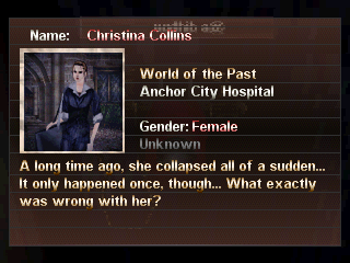
I guess this is not the place to talk about that in particular - see your PM box  UPD: Anyway, for those who haven't seen that:  As you see, practically all in-game text found its place. The problem does remains with menus, items and names as in this example:  |
|
|
|
« Last Edit: March 09, 2009, 09:50:59 pm by aishsha »
|
|
|
|
Gemini
Guest
|
 |
« Reply #1069 on: March 10, 2009, 03:49:25 am » |
|
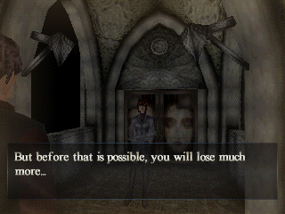
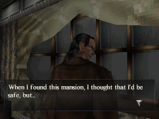
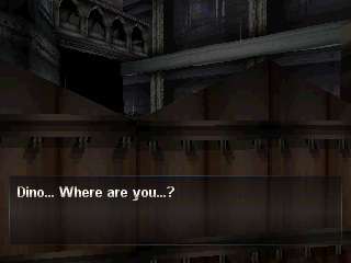
Dialogues semi-hacked and inserted correctly:   Now it needs only better formatted scripts and a way to expand strings decently enough. Before you ask, that "new" font you see is one of the five the game can use, the second I've reinserted. They have all independent width tables and shit now, thanks to another neat hack I did on the font routines. A picture of dialogue with the first font:  |
|
|
|
|
Tauwasser
Guest
|
 |
« Reply #1070 on: March 10, 2009, 05:23:37 am » |
|
I somehow don't like the first one. Is it anti aliased or something? I find it really difficult to read, just imagine a third line in that text box *börk*
cYa,
Tauwasser
|
|
|
|
|
rmco2003
Guest
|
 |
« Reply #1071 on: March 10, 2009, 01:40:41 pm » |
|
I think it's that the letters are a bit too close together, try adding a 1 pixel extra gap between them to see if that improves legibility.
|
|
|
|
|
Dan
Guest
|
 |
« Reply #1072 on: March 10, 2009, 03:38:16 pm » |
|
It doesn't show much, but I've been working on a disassembler/reassembler for early Capcom games. http://romhacks.googlepages.com/capcommusictool.pngCurrently, the disassembled music can be reassembled using cc65. The resulting binary file can be inserted by hand into a ROM. Got to work on something to do that automagically. Is this likely to be of any use to anyone?  \ |
|
|
|
|
rmco2003
Guest
|
 |
« Reply #1073 on: March 10, 2009, 03:48:25 pm » |
|
This looks really cool, looks like you've put a lot of effort into it, is it working on all the games listed in that xml comment?
|
|
|
|
|
Tauwasser
Guest
|
 |
« Reply #1074 on: March 10, 2009, 04:48:52 pm » |
|
Seriously, we have way too little music hacking around. I guess even a basic doc just explaining certain things about waves and basic music, e.g. midi, and stuff would help out a lot. I sure know I know next to nothing about music in general and therefore am unable to hack it in any significant way that aims not to produce static...
cYa,
Tauwasser
|
|
|
|
|
Dan
Guest
|
 |
« Reply #1075 on: March 10, 2009, 05:33:26 pm » |
|
This looks really cool, looks like you've put a lot of effort into it, is it working on all the games listed in that xml comment?
In theory it should work. I've tested it on Megaman 1 + 2, and it works fine. I've copied a track across from Megaman 2 to 1, and it worked. Seriously, we have way too little music hacking around. I guess even a basic doc just explaining certain things about waves and basic music, e.g. midi, and stuff would help out a lot. I sure know I know next to nothing about music in general and therefore am unable to hack it in any significant way that aims not to produce static... Yeah, I don't know anything about music unfortunately either. All of the info on the format came from Bisqwit's document here: http://bisqwit.iki.fi/jutut/megamansource/mmmusic2.txt |
|
|
|
|
Gemini
Guest
|
 |
« Reply #1076 on: March 10, 2009, 11:33:49 pm » |
|
Is it anti aliased or something? I find it really difficult to read, just imagine a third line in that text box *börk* There are some 50% transparent pixels in there, the 2 darkest colors in the palettes. It's not really that hard to read, especially on mid-large TVs, even tho it still needs work on some letters (like the 's'). |
|
|
|
|
Kajitani-Eizan
Guest
|
 |
« Reply #1077 on: March 11, 2009, 12:13:37 am » |
|
yeah, the spacing needs work, but the font looks great overall. i assume it's based on a standard serif font like times new roman, cambria, garamond, computer modern, etc? for the second font (not as cool imo  ), the shading seems a bit odd at the bottom of the "y" (it gets brighter again). |
|
|
|
|
Gemini
Guest
|
 |
« Reply #1078 on: March 11, 2009, 01:09:15 am » |
|
yeah, the spacing needs work, but the font looks great overall. i assume it's based on a standard serif font like times new roman, cambria, garamond, computer modern, etc? Both are based on Times New Roman, but they were made in different editors. The typewriter one was created with Photoshop, the regular one with Paint Shop Pro. No idea why they look so different. :0 for the second font (not as cool imo  ), the shading seems a bit odd at the bottom of the "y" (it gets brighter again). Originally it was dark near in that spot, but it looked really bad on dark backgrounds, so i decided to make it go bright again to create some sort of repeated gradient effect. Check the y and g in this picture to see the horrors of gradients gone wrong:  |
|
|
|
|
Kajitani-Eizan
Guest
|
 |
« Reply #1079 on: March 11, 2009, 08:23:16 am » |
|
ah yeah, that would be problematic. you might be able to soften the gradient on the descenders to make it more natural... though if that's too much of a pain, what you have now is pretty good anyway.
(they're both from times new roman? wow... that "clean" looking font looks like a sans serif font, though... unless the rasterization process used clipped out all the serifs or something.)
|
|
|
|
|
|

 Author