 Author
|
Topic: Screenshots (Read 67899 times)
|
Gemini
Guest
|
 |
« Reply #1845 on: June 04, 2010, 10:26:44 am » |
|
Need some feedback for this one: 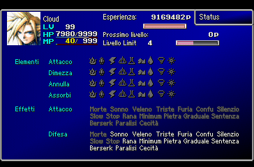 I have rewritten the code for printing attack/defense effects related to statuses, as you can see from the picture. There's a big difference, tho, as I've removed many statuses that really don't make much sense in there. This revision of the menu removes: Near dead (it never shows anywhere), Haste, Regene, Barrier, M-Barrier, Reflect, Ref-absorb (dummy status, no idea what it does), Shield, and Peerless. Statuses kept are: Death, Sleep, Poison, Sad, Fury, Confusion, Silence, Slow, Stop, Toad, Minumum, Pietrify, Gradual Petrify, Death Sentence, Berserk, Paralysis, Darkness. Any suggestions on what should be reimplemented or definitively removed? Consider that many of the statuses I removed cannot be inflicted by attacking, nor can be nullified because there is no equipment or Materia to do so; there are also special cases that are triggered only by particular spells, like Peerless. |
|
|
|
|
DarknessSavior
Guest
|
 |
« Reply #1846 on: June 04, 2010, 01:07:05 pm » |
|
Yeah, if there's no way to activate those as attack or defense, then don't bother.
Was the elemental attack and defense icons before? It's been a long time since I played, but I think it would look better as text.
~DS
|
|
|
|
|
Gideon Zhi
Guest
|
 |
« Reply #1847 on: June 04, 2010, 02:06:00 pm » |
|
From a functionality standpoint, it would be much easier to read if your statuses (statii?) were in uniform columns instead of just rattled off one after another. Just a thought.
(Also, perhaps Ref-Absorb is similar to what happens when Celes uses Runic in FF6? Point is moot if it never happens, but I could definitely see them at least thinking about translating it into materia in the game's design phase.)
|
|
|
|
|
Moulinoski
Guest
|
 |
« Reply #1848 on: June 04, 2010, 07:53:14 pm » |
|
Need some feedback for this one:
[img]http://i239.photobucket.com/albums/ff233/Geminimewtwo/Final%20Fantasy%20VII/statuspag2finale.png[/mg]
I have rewritten the code for printing attack/defense effects related to statuses, as you can see from the picture. There's a big difference, tho, as I've removed many statuses that really don't make much sense in there. This revision of the menu removes: Near dead (it never shows anywhere), Haste, Regene, Barrier, M-Barrier, Reflect, Ref-absorb (dummy status, no idea what it does), Shield, and Peerless. Statuses kept are: Death, Sleep, Poison, Sad, Fury, Confusion, Silence, Slow, Stop, Toad, Minumum, Pietrify, Gradual Petrify, Death Sentence, Berserk, Paralysis, Darkness.
Any suggestions on what should be reimplemented or definitively removed? Consider that many of the statuses I removed cannot be inflicted by attacking, nor can be nullified because there is no equipment or Materia to do so; there are also special cases that are triggered only by particular spells, like Peerless.
Might be asking too much but... Why not make symbols for the status effects instead? |
|
|
|
|
Vanya
Guest
|
 |
« Reply #1849 on: June 05, 2010, 03:53:14 am » |
|
Might be asking too much but... Why not make symbols for the status effects instead? The thought ran my mind too. I think at least FF6 had status icons, but I don't remember clearly. |
|
|
|
|
Carnivol
Guest
|
 |
« Reply #1850 on: June 05, 2010, 05:47:51 am » |
|
No clue about the additional status thingies. Ref-Absorb might be something as obscure as "Reflect Absorbation." Attack someone with reflect and it'll eat their reflect status (Dispel). It's been a while since I played FFVII (late 90s... maybe), but can't you trigger a few rather "unusual" effects by combining certain types of materia? (Just thinking in regards to things like "Attack -> Effect -> Haste/Regen" and stuff) Also is Near Dead something that automatically kills an enemy (instantly) if it has "Low HP" after an attack? From a functionality standpoint, it would be much easier to read if your statuses (statii?) were in uniform columns instead of just rattled off one after another. Just a thought. I agree. They should probably follow some sort of organized grid/layout, instead of just being all thrown in there. Might be asking too much but... Why not make symbols for the status effects instead? Although icons is a nice fix for a lot of things (in many cases), I think DS' suggestion of removing the already existing ones (in favor of text) might be a better solution. There'll be a whole lot of icons there if he adds more to the mix. Not to mention that there'll be icons for something I honestly have no clue how anyone could design a recognizable and good icon for. |
|
|
|
|
Gemini
Guest
|
 |
« Reply #1851 on: June 05, 2010, 07:32:20 am » |
|
Ref-ab is completely unused, tested it myself with a hacked Barrier Materia and it did absolutely nothing other than showing in the status field next to current HP in battle. Wallmarket, a FF7 KERNEL editor, calls such status "Dual" even if it's unused in all Material/Item/Equipment status bit flags, so it's probably just a wrong guess on the author's side. Anyway, I was requesting some external feedback because that menu serves as a reference list as it contains basically any status you can cause/suffer in battle, even those that are completely invisible to the player, like Manipulate (for some reason I forgot to mention it <.<) that behaves correctly only when it affects an enemy. But in case anybody'd like to restore some of those, I made it so that the code can enable/disable them as necessary. All the hacker needs to do is replacing a pointer value with a valid parameter to enable the status of interest, or set the pointer to 0 in order to hide it. I think at least FF6 had status icons, but I don't remember clearly. As well as most games showing elemental properties by using icons/kanji, that's why I'm keeping them as-is (icons come directly from FF6). The occidental versions used simple text, which looked pretty bad in my opinion. Also, there's probably not enough space to make them all appear decently with the current layout, which is why FF7 US/E split the attribute/effect page into two separate pages. Might be asking too much but... Why not make symbols for the status effects instead? They would be kinda hard to understand, while elemental icons are usually extremely easy to guess. Also is Near Dead something that automatically kills an enemy (instantly) if it has "Low HP" after an attack? It's a fake flag used for showing characters in critical conditions (and later in FF8-9 for bosses too). It's automatically removed when HP is greater than 1/4 iirc. Thanks for the feedback so far. :woot!: |
|
|
|
« Last Edit: June 05, 2010, 07:38:17 am by Gemini »
|
|
|
|
Aerdan
Guest
|
 |
« Reply #1852 on: June 05, 2010, 02:13:39 pm » |
|
Honestly, I'd just only print the ones that are active, instead of just graying out the inactive ones. Also, most statuses are fairly clear (blind being a pair of shades, poison being a beaker, etc.) if you put some thought into it.
|
|
|
|
|
Gemini
Guest
|
 |
« Reply #1853 on: June 05, 2010, 03:23:37 pm » |
|
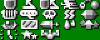
Still, leaving the grayed ones makes you understand better which ones you're not immune to and you can't possibly miss fatal conditions when you're aiming for very powerful characters. That's why I didn't really want to remove them. As for status icons, occidental versions actually come with unused glyphs for those:  I think those were meant to be used in battle where text statuses written with the 8x8 font appear in Japanese builds. Some are kinda hard to decipher. O.o |
|
|
|
|
DarknessSavior
Guest
|
 |
« Reply #1854 on: June 05, 2010, 04:25:14 pm » |
|
Still, leaving the grayed ones makes you understand better which ones you're not immune to and you can't possibly miss fatal conditions when you're aiming for very powerful characters. That's why I didn't really want to remove them. As for status icons, occidental versions actually come with unused glyphs for those:  I think those were meant to be used in battle where text statuses written with the 8x8 font appear in Japanese builds. Some are kinda hard to decipher. O.o Just guessing: Barrier, M-Barrier, Reflect, Haste, ?, ?, Silence, Poison, Paralysis, Petrify, Darkness, ?, Fury, Sadness, ?, ?, Faint/Death, Peerless? ~DS |
|
|
|
|
Neil
Guest
|
 |
« Reply #1855 on: June 05, 2010, 05:45:39 pm » |
|
the harp might be manipulate (harps are usually charm spells)
the last one on the top row looks like a lit bomb... death sentence?
that stripy one might be imprisoned
the sword with the emphasis marks might be duel from the battle with Bottomswell.
|
|
|
|
|
KingMike
Guest
|
 |
« Reply #1856 on: June 05, 2010, 08:28:55 pm » |
|
I'd guess stars were confusion.
The one next to it looks like a clock. Maybe stop or slow?
|
|
|
|
|
tummai
Guest
|
 |
« Reply #1857 on: June 05, 2010, 08:38:24 pm » |
|
Last one on the top row looks like a ball and chain to me. Probably Slow, since it is right next to haste. I agree the bottom left looks like a clock. Stop?
|
|
|
|
|
DarknessSavior
Guest
|
 |
« Reply #1858 on: June 05, 2010, 09:05:18 pm » |
|
I still say that those should all be text. Even the elements. =P
~DS
|
|
|
|
|
Gideon Zhi
Guest
|
 |
« Reply #1859 on: June 05, 2010, 10:25:51 pm » |
|
I still say that those should all be text. Even the elements. =P
~DS
For once, I actually agree. They ALL mean Confusion to me, and seemingly to a lot of others, judging by all the head-scratching comments on the board - we can't even agree on what some of them mean after lengthy discussion! |
|
|
|
|
|

 Author

