 Author
|
Topic: Titlescreens: Screenshots & Edits [Constructive Criticism Only] (Read 19 times)
|
Kitsune Sniper
Guest
|
 |
« Reply #585 on: January 01, 2010, 07:30:25 pm » |
|
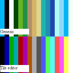
I used Gens to get a screenshot.  I know it's halfassed, but I can't make it bigger without knowing just how many tiles I have available, or if I can only use one color or more. The font (Georgia) is similar, but not exactly the same. I can still do more things to it, like reducing the space between the letters, or making them a bit more streamlined. AFAIK, Genesis tiles use a 4bpp format. My count is about 232 8x8 tiles available. (still need to work on compression, seems to be a different format than the compressed sprite and font tiles). I'm sure I can do it, just been working on formatting the scripts.) (Looking at a Gens savestate, uses almost a full page of 256 tiles - 2 16 tile rows - 6 tiles on another - a couple blank tiles to be safe) I only saw one color being used here - white. I need to know the exact palette available to me so I can make something "pretty". :p |
|
|
|
|
Draken
Guest
|
 |
« Reply #586 on: January 01, 2010, 09:12:10 pm » |
|
It's done!   Wow! I didn't even know anyone was working on this! That looks great!!! Many, many thanks! |
|
|
|
|
FlashPV
Guest
|
 |
« Reply #587 on: January 02, 2010, 02:25:53 am » |
|
It's my new year's gift!  |
|
|
|
|
KingMike
Guest
|
 |
« Reply #588 on: January 02, 2010, 03:37:07 pm » |
|
Nadia palette. Tested by hacking a Gens savestate, so all 16 colors should be usable. 
January 06, 2010, 10:41:49 pm - (Auto Merged - Double Posts are not allowed before 7 days.)
My new title screen:  Just to compare, I scanned an EGM preview containing a title shot of the canned US version.  Unsurprisingly, looks pretty much the same, but squished a bit horizontally (fits within the width of the Data East copyright and has that TM going. |
|
|
|
« Last Edit: January 06, 2010, 10:41:50 pm by KingMike »
|
|
|
|
Kitsune Sniper
Guest
|
 |
« Reply #589 on: January 07, 2010, 10:46:59 am » |
|
Nadia palette. Tested by hacking a Gens savestate, so all 16 colors should be usable. 
January 06, 2010, 10:41:49 pm - (Auto Merged - Double Posts are not allowed before 7 days.)
My new title screen:  Just to compare, I scanned an EGM preview containing a title shot of the canned US version.  Unsurprisingly, looks pretty much the same, but squished a bit horizontally (fits within the width of the Data East copyright and has that TM going. Whoa, there was a US version planned @_@ I'll try to edit the title screen to add the "PLAYERS" bit. I don't remember if it was possible or not. And I'll give the Nadia title screen another shot. |
|
|
|
|
KingMike
Guest
|
 |
« Reply #590 on: January 08, 2010, 12:38:08 am » |
|
I think someone even listed an alleged US proto on ebay a couple years ago, but it seems that if it sold (can't remember), it went to an un-sharing collector.  |
|
|
|
|
Kitsune Sniper
Guest
|
 |
« Reply #591 on: January 08, 2010, 12:51:49 am » |
|
I think someone even listed an alleged US proto on ebay a couple years ago, but it seems that if it sold (can't remember), it went to an un-sharing collector.  Having beaten the game I can say this: He spent his money on absolute garbage and he wasted his money.  |
|
|
|
|
|
|
Kagemusha
Guest
|
 |
« Reply #593 on: February 16, 2010, 04:21:04 pm » |
|
 Hell's Bells anyone?Already done. While I'm at it, I might as well show off something a friend of a friend did.  Still needs the colors to be changed so they match the palette though. |
|
|
|
« Last Edit: February 17, 2010, 04:06:52 pm by Pennywise »
|
|
|
|
KingMike
Guest
|
 |
« Reply #594 on: February 16, 2010, 07:34:37 pm » |
|
This topic need some action!   That looks great. Thanks! |
|
|
|
|
Kagemusha
Guest
|
 |
« Reply #595 on: February 21, 2010, 03:58:14 pm » |
|
 Technically not the actual title screen, but an ending logo. Although this is what the title screen will look like once hacked. |
|
|
|
|
Tauwasser
Guest
|
 |
« Reply #596 on: February 21, 2010, 04:47:33 pm » |
|
That seems pretty empty. *Constructive Criticism Only* Err.. let me rephrase that: I think more graphics would be good for a title screen. A bigger logo with less alias would look good, too. cYa, Tauwasser |
|
|
|
|
KingMike
Guest
|
 |
« Reply #597 on: February 21, 2010, 10:09:16 pm » |
|
I suppose we'll have to wait and see what it looks like when the actual title screen is hacked. But I'd guess it wouldn't so empty on the actual title screen. Assuming this is Hi no Tori, I'd guess you'd have the Konami logo and copyright text to fill space?  Is it still going to be in that big green scroll? |
|
|
|
|
Kagemusha
Guest
|
 |
« Reply #598 on: February 22, 2010, 07:03:14 am » |
|
I will agree that the logo could be a tad bigger, but not by much. I'm limited in my number of tiles available and also the graphic has to be recompressed and needs to fit into the original space. Anyway, I've mostly hacked the title screen, but there's a very obvious issue left.  |
|
|
|
|
KingMike
Guest
|
 |
« Reply #599 on: February 22, 2010, 09:44:48 am » |
|
If you can, I think it'd be better to remove the empty space towards the bottom of the scroll and move the copyright text up and/or center the logo a bit.
|
|
|
|
|
|


 Author


