 Author
|
Topic: Titlescreens: Screenshots & Edits [Constructive Criticism Only] (Read 19 times)
|
Kitsune Sniper
Guest
|
 |
« Reply #570 on: December 06, 2009, 04:08:19 pm » |
|
And since he was kind enough to let me swipe the title screen, I'll be handing him a copy of the original English script so he can translate that to French.
We need more international collaborations, people. ;P
|
|
|
|
« Last Edit: December 06, 2009, 06:11:59 pm by Kitsune Sniper »
|
|
|
|
FlashPV
Guest
|
 |
« Reply #571 on: December 30, 2009, 06:33:48 am » |
|
WIP  |
|
|
|
|
KingMike
Guest
|
 |
« Reply #572 on: December 30, 2009, 09:42:57 am » |
|
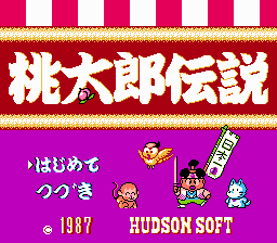
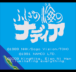
A couple that still have awhile to go before completion, but I thought I'd request them.  The Legend of Peach Boy  Nadia - The Secret of Blue Water (sorry if the image is kind of crappy. I believe the game uses the 256 pixel wide mode, but Kega Fusion stretches it to 320x240, and stored the screenshot at double size. So, I tried to reverse it.) (somebody able to do better at converting the official logo?)  |
|
|
|
« Last Edit: December 30, 2009, 09:54:35 am by KingMike »
|
|
|
|
RedComet
Guest
|
 |
« Reply #573 on: December 30, 2009, 11:57:00 am » |
|
(sorry if the image is kind of crappy. I believe the game uses the 256 pixel wide mode, but Kega Fusion stretches it to 320x240, and stored the screenshot at double size. So, I tried to reverse it.)
Take the picture with Gens.  |
|
|
|
|
|
|
KingMike
Guest
|
 |
« Reply #575 on: December 31, 2009, 12:05:19 pm » |
|
That looks awesome.
|
|
|
|
|
I.S.T.
Guest
|
 |
« Reply #576 on: December 31, 2009, 12:08:33 pm » |
|
Indeed!
|
|
|
|
|
Jedi QuestMaster
Guest
|
 |
« Reply #577 on: January 01, 2010, 12:14:52 am » |
|
 Nadia - The Secret of Blue Water (sorry if the image is kind of crappy. I believe the game uses the 256 pixel wide mode, but Kega Fusion stretches it to 320x240, and stored the screenshot at double size. So, I tried to reverse it.) (somebody able to do better at converting the official logo?)  Wow - 16-bit Nadia! I'm planning on redoing the NES title screen using the same logo. Maybe you can go off that? Maybe not.  |
|
|
|
|
Kitsune Sniper
Guest
|
 |
« Reply #578 on: January 01, 2010, 02:11:08 am » |
|
I used Gens to get a screenshot.  I know it's halfassed, but I can't make it bigger without knowing just how many tiles I have available, or if I can only use one color or more. The font (Georgia) is similar, but not exactly the same. I can still do more things to it, like reducing the space between the letters, or making them a bit more streamlined. |
|
|
|
|
DarknessSavior
Guest
|
 |
« Reply #579 on: January 01, 2010, 02:14:06 am » |
|
Is it worth mentioning that the title says ãµã—ãŽã®ã†ã¿ã®ãƒŠãƒ‡ã‚£ã‚¢ (Nadia of the Mysterious Sea)? >_>"";
~DS
|
|
|
|
|
BRPXQZME
Guest
|
 |
« Reply #580 on: January 01, 2010, 04:06:34 am » |
|
Georgia isn’t really made for logos. Trajan or Caslon would be more like it. Even better would be imitating the Japanese logo’s style, but that does take a good deal of artistic vision. Kind of wispy, that brush work. Is it worth mentioning that the title says ãµã—ãŽã®ã†ã¿ã®ãƒŠãƒ‡ã‚£ã‚¢ (Nadia of the Mysterious Sea)? >_>"";
~DS
They pulled stuff like that a lot back when Anno directed stuff. Evangelion has it for nearly every term of import (n番目ã®é©æ ¼è€… = nth Children, 使徒 = Angel, most episode titles have either a slightly-off translation or a tangentially-related term instead of a translation, etc.). For Eva in particular, the blame lies mostly in Anno’s vision for the series. |
|
|
|
|
creaothceann
Guest
|
 |
« Reply #581 on: January 01, 2010, 10:06:36 am » |
|
Georgia isn’t really made for logos. Trajan or Caslon would be more like it.
Even better would be imitating the Japanese logo’s style, but that does take a good deal of artistic vision. Kind of wispy, that brush work.
How about these? edo.ttfGOTHIRUS.TTF |
|
|
|
|
BRPXQZME
Guest
|
 |
« Reply #582 on: January 01, 2010, 11:55:52 am » |
|
Most of these logos are done with actual, physical ink and a brush, and are executed by master calligraphers who do it for a living. Digital fonts are right out!
|
|
|
|
|
KingMike
Guest
|
 |
« Reply #583 on: January 01, 2010, 02:41:59 pm » |
|
I used Gens to get a screenshot.  I know it's halfassed, but I can't make it bigger without knowing just how many tiles I have available, or if I can only use one color or more. The font (Georgia) is similar, but not exactly the same. I can still do more things to it, like reducing the space between the letters, or making them a bit more streamlined. AFAIK, Genesis tiles use a 4bpp format. My count is about 232 8x8 tiles available. (still need to work on compression, seems to be a different format than the compressed sprite and font tiles). I'm sure I can do it, just been working on formatting the scripts.) (Looking at a Gens savestate, uses almost a full page of 256 tiles - 2 16 tile rows - 6 tiles on another - a couple blank tiles to be safe) |
|
|
|
|
creaothceann
Guest
|
 |
« Reply #584 on: January 01, 2010, 06:41:01 pm » |
|
Most of these logos are done with actual, physical ink and a brush, and are executed by master calligraphers who do it for a living. Digital fonts are right out!
*shrug* They could be used as a starting point. |
|
|
|
|
|
 Author


