+  RHDN Forum Archive
|-+  Romhacking
| |-+  ROM Hacking Discussion
| | |-+  Titlescreens: Screenshots & Edits [Constructive Criticism Only]
Pages: 1 ... 25 26 [27] 28 29 ... 52
Author Topic: Titlescreens: Screenshots & Edits [Constructive Criticism Only]  (Read 25 times)
KaioShin
Guest
« Reply #390 on: December 30, 2007, 06:28:35 am »

I see, and it's a very nice hobby too. It's in very high demand as you've seen in this thread  Wink Most translation hackers are technically inclined people and totally fail at artistic stuff. Good that everyone has different strengths and weaknesses.
Nightcrawler
Guest
« Reply #391 on: December 30, 2007, 11:00:55 am »

Quote from: KaioShin on December 30, 2007, 06:28:35 am
I see, and it's a very nice hobby too. It's in very high demand as you've seen in this thread  Wink Most translation hackers are technically inclined people and totally fail at artistic stuff. Good that everyone has different strengths and weaknesses.

Amen brother KaioShin! I fit in that category for sure.
Crysta
Guest
« Reply #392 on: December 30, 2007, 11:53:10 am »


One last edit to center the title on the screen better.
FlashPV
Guest
« Reply #393 on: January 01, 2008, 06:50:38 am »

I'm bored. Happy new year.
DaMarsMan
Guest
« Reply #394 on: January 01, 2008, 12:52:58 pm »

Nice work FlashPV

As for DQM.... It looks great but I thought it might look better this way.

KaioShin
Guest
« Reply #395 on: January 01, 2008, 12:56:46 pm »

Quote from: DaMarsMan on January 01, 2008, 12:52:58 pm
Nice work FlashPV

As for DQM.... It looks great but I thought it might look better this way.


Keep the whole screen in mind when the background and main DQ logo are added to it. The "Monsters" should be centered IMO since it accompanies the main DQ logo and not so much the Caravan Heart logo.
FlashPV
Guest
« Reply #396 on: January 01, 2008, 01:49:08 pm »

As the original logo:
Moulinoski
Guest
« Reply #397 on: January 01, 2008, 02:59:12 pm »

By God... Terry is uglier than sin in DQM... I always get sick when I see DQM's cover... I had thought it was only for the American version of DQM that they used the CG art...
DaMarsMan
Guest
« Reply #398 on: January 01, 2008, 03:08:34 pm »

That's true but that capital H gets in the way and makes it look cramped in my opinion. Maybe if you could move the Caravan Heart part down a bit.
Neil
Guest
« Reply #399 on: January 01, 2008, 03:27:12 pm »

why not make it all the same case?
Crysta
Guest
« Reply #400 on: January 01, 2008, 03:50:16 pm »

Quote from: DaMarsMan on January 01, 2008, 03:08:34 pm
That's true but that capital H gets in the way and makes it look cramped in my opinion. Maybe if you could move the Caravan Heart part down a bit.

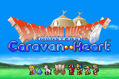
Could always shrink the H a pixel or two:


Or use the halfsize H I used before:


Actually I think I prefer the two pixels shorter one. Doesn't look too bad:


DaMarsMan
Guest
« Reply #401 on: January 01, 2008, 03:55:30 pm »

That last one looks perfect.
KaioShin
Guest
« Reply #402 on: January 01, 2008, 04:21:05 pm »

Quote from: DaMarsMan on January 01, 2008, 03:55:30 pm
That last one looks perfect.

Absolutely!

I was just about to write that I'd need to see how it looks complete with the background when you posted this.

Thanks  :thumbsup:
I.S.T.
Guest
« Reply #403 on: January 01, 2008, 04:28:15 pm »

So I guess you have about five people to credit in your readme.... Wink
KaioShin
Guest
« Reply #404 on: January 01, 2008, 04:31:31 pm »

Quote from: I.S.T. on January 01, 2008, 04:28:15 pm
So I guess you have about five people to credit in your readme.... Wink

The list is propably 10 pages long anyway, so it doesn't matter anymore  Wink
Pages: 1 ... 25 26 [27] 28 29 ... 52  


Powered by SMF 1.1.4 | SMF © 2006-2007, Simple Machines LLC