+  RHDN Forum Archive
|-+  Romhacking
| |-+  ROM Hacking Discussion
| | |-+  Screenshots
Pages: 1 ... 5 6 [7] 8 9 ... 164
Author Topic: Screenshots  (Read 67882 times)
Moulinoski
Guest
« Reply #90 on: November 16, 2007, 11:46:16 am »

Quote from: Kitsune Sniper on November 15, 2007, 06:17:41 pm
Quote from: Garoth Moulinoski on November 15, 2007, 05:39:41 pm
If I may so ask without being ridiculed... What game is that screenshot from?
Namco X Capcom!

OoOoh...

Quote from: KaioShin on November 16, 2007, 05:35:13 am
Quote from: Panzer88 on November 16, 2007, 02:59:45 am
The ULTIMATE FIGHTING CROSSOVER....

But this time it's a SRPG!

That's kinda crazy though! XD Kinda reminds about the first time I heard of the Samurai Shodown RPG. I was like WTF?!
Piotyr
Guest
« Reply #91 on: November 16, 2007, 12:22:52 pm »

Quote from: Kitsune Sniper on November 16, 2007, 10:25:29 am
I only recognized the game because of the foxgirl. Embarrassed

... YIFF YIFF YIFF! Tongue
Talbain
Guest
« Reply #92 on: November 19, 2007, 12:45:16 pm »

Quote from: Gideon Zhi on November 09, 2007, 12:08:22 pm

Mm... delicious.  Can't wait for the release of this.
RedComet
Guest
« Reply #93 on: November 19, 2007, 11:16:31 pm »

Comix Zone's font in Spider-Man: Lethal Foes:


Keep in mind, I haven't added the VWF just yet, so the letters will be slightly closer in the final product. Right now I'm just seeing how the font itself looks.

Comments and feedback are more than welcome.

EDIT:
« Last Edit: November 19, 2007, 11:25:27 pm by RedComet »
byuu
Guest
« Reply #94 on: November 20, 2007, 02:57:22 am »

Quote
Comix Zone's font in Spider-Man: Lethal Foes:

Wow! Man, that is one impressive looking video game! What system is it for? With so much detail on screen at once, it looks like it could almost be a PS2 game ...
Kitsune Sniper
Guest
« Reply #95 on: November 20, 2007, 03:09:42 am »

Quote from: byuu on November 20, 2007, 02:57:22 am
Quote
Comix Zone's font in Spider-Man: Lethal Foes:

Wow! Man, that is one impressive looking video game! What system is it for? With so much detail on screen at once, it looks like it could almost be a PS2 game ...

*slaps you around*

SNES. Tongue

RedComet: That doesn't look like the Comix Zone font to me... It lacks the shading it has while in the game.

That said, could I get a copy of it? ;p I'd like to add it to my site's font archive. Cheesy
RedComet
Guest
« Reply #96 on: November 20, 2007, 09:59:20 am »

Quote from: Kitsune Sniper on November 20, 2007, 03:09:42 am
RedComet: That doesn't look like the Comix Zone font to me... It lacks the shading it has while in the game.

I can assure you that that is the Comix Zone font and those are the exact same colors used in Comix Zone for the shading. I think the reason it doesn't look the same is a combination of no VWF and the outline of the text box not being shaded like it is in CZ.

As for a copy, sure. Catch me on MSN tonight and I'll send it your way.
DarknessSavior
Guest
« Reply #97 on: November 20, 2007, 01:26:14 pm »

Quote
Comix Zone's font in Spider-Man: Lethal Foes:

So you finally got it, eh? Good job. It looks nice. I can't wait to see what ASM magic you put together to make it look even better. ^_^

~DS
Rai
Guest
« Reply #98 on: November 22, 2007, 11:40:14 pm »

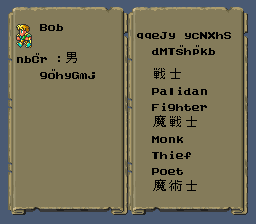
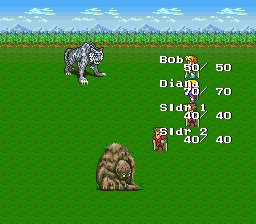
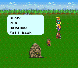
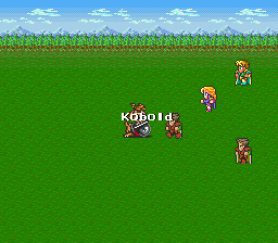
Really early Romancing Saga screenshots.


Numonohi_Boi
Guest
« Reply #99 on: November 22, 2007, 11:47:33 pm »

sweet, both 4 (RS1) and 5(RS2) both being picked up again this close together. Things are looking good for SaGa
GenoBlast
Guest
« Reply #100 on: November 24, 2007, 01:24:43 pm »

Rai, you are God! I fucking love SaGa.
Cless
Guest
« Reply #101 on: November 25, 2007, 04:05:55 am »

All right, I know this game has an absolutely amazing remake on the PS2 that completely makes this version irrelevant, but I've started playing around with the PS1 Tales of Destiny. No, not a retranslation.

The main idea was to update the localization a bit, improve the menu cosmetics, uncensor some things, and maybe add a few little touches here and there.

A lot of legacy terms in recent US Tales games have begun getting translated much more consistently in recent outings, and many of the ones in this old game differ from those, so I've decided to update them with modern equivalents.

After my extensive work on prettying up the menus in ToP PSX, I was kinda thirsty for more. I mean, I actually get a kick out of playing with cosmetics. I looked back at this game after that and thought "man, they FAILED." Sad I've become more critical of this stuff since doing ToP, I never really noticed how much they sucked the last time I played it.

So, onto the screens, before, and after.

Main Menu:


I replaced the 8x8 VWF with the one I've been using in ToP PSX. Not only do I think it looks better, but it saves a lot of much-needed screen space as well. I retained the original numbers, except that awful football 0.

One of the things that sucked about the original menus was how inconsistent things were. I aligned all the words and numbers and I think the result is much more aesthetically pleasing.

Items Menu:


So much abbreviating. Widened the columns, now the full name of every item can be displayed in the list. Green Crystal Rod is the longest item name. Also centered the menu name.

I know that the apostrophe appears higher than it should. I'm being a bit lazy about adjusting it though.

Equipment Menu:


Font change really saves the day here.  Full item names fit just fine in both columns.

Techs Menu:


This menu has had NO cosmetic hacking yet, but man, Stahn's original tech list was incredibly out of date.
vivify93
Guest
« Reply #102 on: November 25, 2007, 06:48:31 am »

That looks awesome, Cless!
Everything looks 200 times better than what they did originally.

As for constructive criticism... Um... Err...

I don't have any. Is this a good thing or a bad thing...? Probably a good thing. :thumbsup:
ghettoyouth
Guest
« Reply #103 on: November 25, 2007, 07:34:20 am »

Gemini
Guest
« Reply #104 on: November 25, 2007, 07:56:55 am »

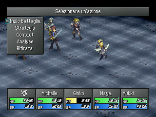
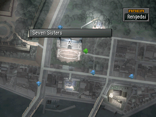
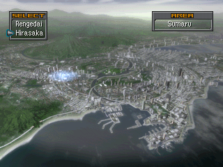
Some random screens from Innocent Sin:
   

Translation is progressing once again, so hurray. Don't mind the first screen, those strings are just place holders. Wink
Pages: 1 ... 5 6 [7] 8 9 ... 164  


Powered by SMF 1.1.4 | SMF © 2006-2007, Simple Machines LLC