 Author
|
Topic: Screenshots (Read 67895 times)
|
Gemini
Guest
|
 |
« Reply #1965 on: September 14, 2010, 01:32:19 pm » |
|
Also, that font looks kinda weird and hard to read even if it's thick like a whale's skin.
|
|
|
|
|
reyvgm
Guest
|
 |
« Reply #1966 on: September 14, 2010, 01:33:31 pm » |
|
Yeah, 'dudes' sounds like the ridiculous USA translation.
|
|
|
|
|
Kagemusha
Guest
|
 |
« Reply #1967 on: September 14, 2010, 02:25:58 pm » |
|
The font's probably hard to read because it's highlighted. I've actually thought about using a different all caps one like Contra or Metal Gear.
|
|
|
|
|
KingMike
Guest
|
 |
« Reply #1968 on: September 24, 2010, 12:53:31 am » |
|
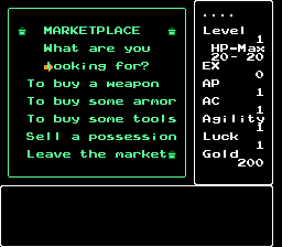
 Originally, the town menu had icons in the corners of each menu. I removed the lower-left to fit this menu in. Perhaps I should remove the bottom corner icons in all menus for a consistent look? (yes, the cursor's going to be the next thing I look at after finishing insertion of the rest of the windows) The only issue is that I hope the shop menus will allow me to put the prices between the lines of text, so the full item names can fit in. Otherwise, the hacking is looking to be in pretty good shape. (too bad this one seems to be lacking in cheat codes, unlike the other games, to speed up the testing process) |
|
|
|
|
Moulinoski
Guest
|
 |
« Reply #1969 on: September 24, 2010, 11:17:13 am » |
|
[IMG]http://i55.photobucket.com/albums/g155/sahagin/118.png[/img
Originally, the town menu had icons in the corners of each menu.
I removed the lower-left to fit this menu in.
Perhaps I should remove the bottom corner icons in all menus for a consistent look?
(yes, the cursor's going to be the next thing I look at after finishing insertion of the rest of the windows)
The only issue is that I hope the shop menus will allow me to put the prices between the lines of text, so the full item names can fit in.
Otherwise, the hacking is looking to be in pretty good shape.
(too bad this one seems to be lacking in cheat codes, unlike the other games, to speed up the testing process)
Is that Ys? Isn't it already translated? |
|
|
|
|
KingMike
Guest
|
 |
« Reply #1970 on: September 24, 2010, 12:58:07 pm » |
|
Deep Dungeon II: The Hero's Crest for the FDS.
|
|
|
|
|
Jedi QuestMaster
Guest
|
 |
« Reply #1971 on: September 24, 2010, 02:19:37 pm » |
|
 Originally, the town menu had icons in the corners of each menu. I removed the lower-left to fit this menu in. At first I didn't know what you were talking about, then I noticed them.  Perhaps I should remove the bottom corner icons in all menus for a consistent look?
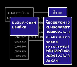
Yeah, just having the top ones seems okay. Anywho: Don't mind the strings, it's cavespeak. Right now I'm working on the text. The caps all look fine to me, except maybe the 'T' but I'll see how it looks with actual words & who knows? I might keep it that way.  Wait a minute, t-z is not on here! On no!  Oh well, t is just a flipped f, & the rest aren't that complicated. Actually, you can see it used somewhere in the back. |
|
|
|
|
xdaniel
Guest
|
 |
« Reply #1972 on: September 24, 2010, 02:39:24 pm » |
|
Was itching to work on something translation-related again:  Changing the screen positions of text/values without a debugger is a pain. Also, I'd rather have the HP next to "State", "Food" (actually "Stomach") where HP is now and that, as well as "Strength", left-aligned - however, while I can move the HP values where I'd want them, I can't move the actual "HP: / " text there without it being overwritten by empty tiles(?!)! |
|
|
|
|
Moulinoski
Guest
|
 |
« Reply #1973 on: September 24, 2010, 03:58:19 pm » |
|
Deep Dungeon II: The Hero's Crest for the FDS.
Bah. Never heard of it. Was itching to work on something translation-related again:  Changing the screen positions of text/values without a debugger is a pain. Also, I'd rather have the HP next to "State", "Food" (actually "Stomach") where HP is now and that, as well as "Strength", left-aligned - however, while I can move the HP values where I'd want them, I can't move the actual "HP: / " text there without it being overwritten by empty tiles(?!)! Digimon D-Project?! |
|
|
|
|
Jedi QuestMaster
Guest
|
 |
« Reply #1974 on: September 24, 2010, 04:10:09 pm » |
|
Digimon D-Project?!
Why didn't I notice?! And what's with No./Poo? |
|
|
|
|
DaMarsMan
Guest
|
 |
« Reply #1975 on: September 24, 2010, 04:26:46 pm » |
|
|
|
|
|
|
xdaniel
Guest
|
 |
« Reply #1976 on: September 24, 2010, 04:34:41 pm » |
|
Digimon D-Project?!
Why didn't I notice?! And what's with No./Poo? Yep, it's D-Project for WonderSwan  And No./Poo is originally "ウンãƒã®ã‹ãš" or "Number of feces" (well, how many times a Digimon made one of those typical pink piles of crap). The translation itself is still very much temporary, so that abbreviation is probably gonna change to something more easily recognizable... |
|
|
|
|
KingMike
Guest
|
 |
« Reply #1977 on: September 24, 2010, 06:33:13 pm » |
|
 Wait a minute, t-z is not on here! On no!  Oh well, t is just a flipped f, & the rest aren't that complicated. Actually, you can see it used somewhere in the back. Did you possibly replace some katakana (you can use Select to choose hiragana/katakana on the menu. Though I'd guess for a finished translation you'd either want to mirror the English alphabet on both pages, or disable Select, whichever's easier.) |
|
|
|
|
Jedi QuestMaster
Guest
|
 |
« Reply #1978 on: September 25, 2010, 06:49:10 pm » |
|
I'm still not quite sure on that - I think I'll stick with what J2E had, but include extra characters. Notice the accent marks?  Not sure if anyone will use them.  \ |
|
|
|
|
tc
Guest
|
 |
« Reply #1979 on: September 25, 2010, 08:43:19 pm » |
|
Digimon D-Project?!
Why didn't I notice?! And what's with No./Poo? Yep, it's D-Project for WonderSwan  Hey, before I forget. Wasn't one Digimon for WonderSwan actually available in English? I've got a Swancrystal that isn't getting much use with only owning two games. It could be difficult to track down such a thing from obscure parts of Asia however... |
|
|
|
|
|
 Author