 Author
|
Topic: Screenshots (Read 67903 times)
|
DarknessSavior
Guest
|
 |
« Reply #1710 on: March 28, 2010, 03:51:05 pm » |
|
Actually, since I no longer need the space, I plan on moving the borders of the item menu back to where they originally were, so that the "Items" part at the top will match.
Also, I think there's a misunderstanding on the part of the trash can. See how the hand is on Fuma Shuriken? That's the last slot available for text. Because I changed the coding, there's an extra 'secret' slot underneath that where the trashcan is. I'm not entirely sure how to handle that, since technically you can put an actual item there. But I always left the trash can at the bottom, myself. If I can find a way to lock it in place, I think I'll do that, since moving the trashcan anywhere else screws up my item list to begin with.
As far as the controller stuff? I'm gonna fix it soon enough.
As far as letting other people use my work? I mean, I'm gonna release the patch to the public, so if you want to take my hacks and mess with other stuff on top of it, by all means. Just give me credit for doing all of the stuff I did.
~DS
|
|
|
|
|
|
|
Nightcrawler
Guest
|
 |
« Reply #1712 on: March 31, 2010, 09:17:49 am » |
|
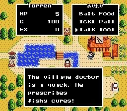
What's up with those weird tiny a's?
|
|
|
|
|
DaMarsMan
Guest
|
 |
« Reply #1713 on: March 31, 2010, 10:51:32 am » |
|
Great job Rai! You've come a long way!
|
|
|
|
|
9volt Kappa
Guest
|
 |
« Reply #1714 on: March 31, 2010, 10:54:36 am » |
|
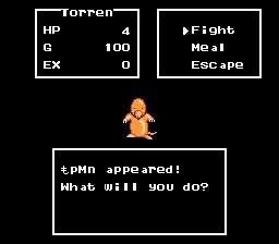
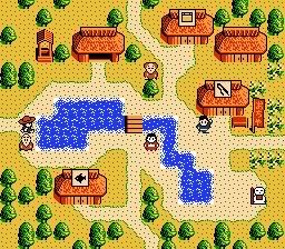
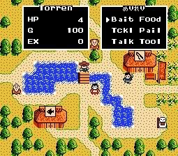
Translation is going pretty well thanks to the help of snark and my DTE routine.
Most of the technical hurdles have been overcome and this should be done in no time. This'll probably be my first complete translation patch when it's done.
 Glad to see someone's working on this |
|
|
|
|
KingMike
Guest
|
 |
« Reply #1715 on: March 31, 2010, 02:54:35 pm » |
|
What's up with those weird tiny a's?
Second. Might want to make the a bigger. |
|
|
|
|
DarknessSavior
Guest
|
 |
« Reply #1716 on: March 31, 2010, 03:36:30 pm » |
|
What's up with those weird tiny a's?
Second. Might want to make the a bigger. Thirded. Or, just make the entire font more uniform. The 'i' and 'l' don't look that great either. ~DS |
|
|
|
|
RedComet
Guest
|
 |
« Reply #1717 on: March 31, 2010, 03:58:23 pm » |
|
Great job Rai! You've come a long way!
This. I for one am proud of you Rai. |
|
|
|
|
DarknessSavior
Guest
|
 |
« Reply #1718 on: March 31, 2010, 05:38:28 pm » |
|
Great job Rai! You've come a long way!
This. I for one am proud of you Rai. Indeed. As am I. Glad to see you're finally comin' along. ^^; ~DS |
|
|
|
|
Moulinoski
Guest
|
 |
« Reply #1719 on: March 31, 2010, 07:15:45 pm » |
|
Romhacking.net is like that tough big brother you never had. It punches you square in the face, but only out of love and respect.
|
|
|
|
|
JaytheHam
Guest
|
 |
« Reply #1720 on: April 03, 2010, 06:03:03 pm » |
|
|
|
|
|
|
Tauwasser
Guest
|
 |
« Reply #1721 on: April 03, 2010, 07:24:18 pm » |
|
What's the original resolution of those? It seems kinda teensy-tinsy compared to the Japanese. What was the limiting factor here, VRAM space or rom space, or screen space? I think you did a good job for half-width. However, if this is indeed the original resolution (seems game boy to me  ), it might help visually to really have the g's and y's have descenders instead of them being above the baseline. Mockup:  I understand 4×8 pixels is not a lot of space to work with... cYa, Tauwasser |
|
|
|
|
JaytheHam
Guest
|
 |
« Reply #1722 on: April 03, 2010, 08:20:07 pm » |
|
Oh! Good idea, I didn't think of that, but there just so happened to be a spare pixel at the top of every tile so I've taken your suggestion  Yea it's Gameboy: http://www.fogu.com/hm/rkadventure/The reason is limited screen space, a lot of the menus etc only allow 2-3 tiles per label which is far too little to fit any meaningful English word into. Those Kanji aren't the normal Japanese characters, they're special multi-tile characters used in the constellation notes, the original Japanese is 8x8 per character. |
|
|
|
|
Rai
Guest
|
 |
« Reply #1723 on: April 04, 2010, 08:10:10 am » |
|
 Started inserting some of snark's text translations. The game's text is a little hard to work with since the game loads the starting offset of EACH line in the game. This means that if the starting offset of one line is wrong, the text screws up. Fortunately modifying the offset each line starts at isn't too hard. Game basically loads the first 2 bytes of the offset into x and the second 2 bytes of the offset in Y. |
|
|
|
|
DaMarsMan
Guest
|
 |
« Reply #1724 on: April 04, 2010, 02:45:02 pm » |
|
 Started inserting some of snark's text translations. The game's text is a little hard to work with since the game loads the starting offset of EACH line in the game. This means that if the starting offset of one line is wrong, the text screws up. Fortunately modifying the offset each line starts at isn't too hard. Game basically loads the first 2 bytes of the offset into x and the second 2 bytes of the offset in Y. Looking good! Perhaps you should expand the window by 2 tiles on both sides. That should make it a little more pleasing to read in English. |
|
|
|
|
|
 Author

 Glad to see someone's working on this


 ), it might help visually to really have the g's and y's have descenders instead of them being above the baseline.
