MathOnNapkins
Guest
|
 |
« Reply #1350 on: October 20, 2009, 09:06:52 am » |
|
What does this program take for file input? An SPC file seems to be suggested by the options.
Currently it just takes SPC files, but I also want it to be able to open raw BRR sample files, the format of which I have not determined yet. I mean I could leave it as just plain binary with 2 extra bytes to indicate the loop point... but that seems limited. Previously when I've ripped samples out of SPC files or ROMs it consisted of the format I just mentioned, but I'm not sure if there's a better way. If you hover the mouse over the sliders, can you see the actual numerical value you're selecting?
No, but that's a good idea. |
|
|
|
|
Kagemusha
Guest
|
 |
« Reply #1351 on: October 23, 2009, 01:29:20 pm » |
|
 Was wondering if I could get some feedback on the font chosen. Generally to maintain that classic NES feel, a game would use an all-caps font. Plus this is a Contra game, but I'm not sure if there's a special font associated with it. |
|
|
|
|
Spikeman
Guest
|
 |
« Reply #1352 on: October 23, 2009, 02:14:55 pm » |
|
Not familiar with the game but I think that font looks great!  |
|
|
|
|
Dragonsbrethren
Guest
|
 |
« Reply #1353 on: October 23, 2009, 02:22:12 pm » |
|
Personally, I'd use the English font from the original. It had a style of its own, which was pretty memorable, for me at least.
|
|
|
|
|
DarknessSavior
Guest
|
 |
« Reply #1354 on: October 23, 2009, 02:22:42 pm » |
|
 Was wondering if I could get some feedback on the font chosen. Generally to maintain that classic NES feel, a game would use an all-caps font. Plus this is a Contra game, but I'm not sure if there's a special font associated with it. Same font you used in that other shooter that I wanted to steal. Looks nice. XD ~DS |
|
|
|
|
Kagemusha
Guest
|
 |
« Reply #1355 on: October 23, 2009, 02:35:45 pm » |
|
Not familiar with the game but I think that font looks great! It's the Japanese version for Contra. I'm doing a new translation for it. Intro now done.    Oh and I do like this font. It's become a favorite of mine. |
|
|
|
|
Nightcrawler
Guest
|
 |
« Reply #1356 on: October 23, 2009, 02:38:24 pm » |
|
Font looks great to me.  |
|
|
|
|
Neil
Guest
|
 |
« Reply #1357 on: October 23, 2009, 03:22:02 pm » |
|
Bill and Lance... are you sure one of those isn't supposed to be Neil? :angel:
|
|
|
|
|
I.S.T.
Guest
|
 |
« Reply #1358 on: October 23, 2009, 03:38:40 pm » |
|
Font looks great to me.  Agreed. |
|
|
|
|
green-kirby
Guest
|
 |
« Reply #1359 on: October 23, 2009, 04:22:35 pm » |
|
|
|
|
|
|
reyvgm
Guest
|
 |
« Reply #1360 on: October 23, 2009, 05:09:04 pm » |
|
 Was wondering if I could get some feedback on the font chosen. Generally to maintain that classic NES feel, a game would use an all-caps font. Plus this is a Contra game, but I'm not sure if there's a special font associated with it. I think it would look better with the original Japanese font (you can see it used in the credits). Not only it will look as if the game was never in Japanese, but it will also look like the usual NES Contra font. |
|
|
|
|
creaothceann
Guest
|
 |
« Reply #1361 on: October 23, 2009, 08:18:45 pm » |
|
Maybe two patches? Could not be worth the work though.
|
|
|
|
|
reyvgm
Guest
|
 |
« Reply #1362 on: October 23, 2009, 09:00:05 pm » |
|
Two patches would be bliss.
|
|
|
|
|
Kagemusha
Guest
|
 |
« Reply #1363 on: October 23, 2009, 09:30:40 pm » |
|
Oh two patches would be just too much work  |
|
|
|
|
Moulinoski
Guest
|
 |
« Reply #1364 on: October 25, 2009, 03:18:01 pm » |
|
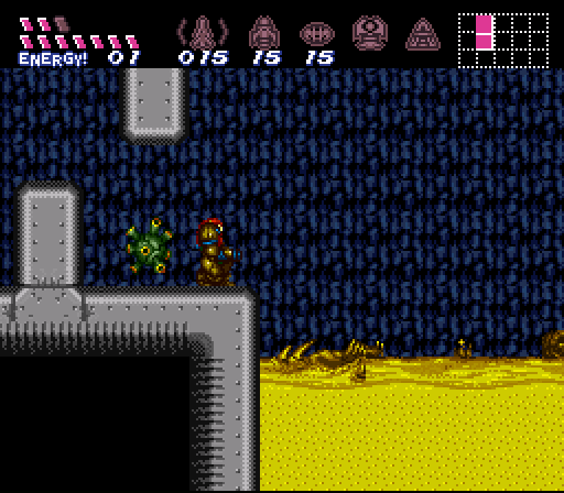
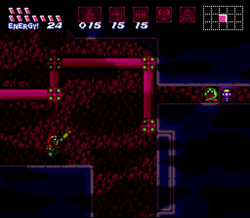
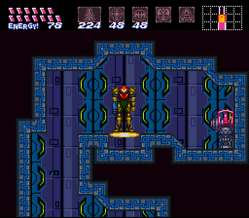
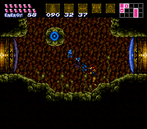
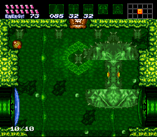
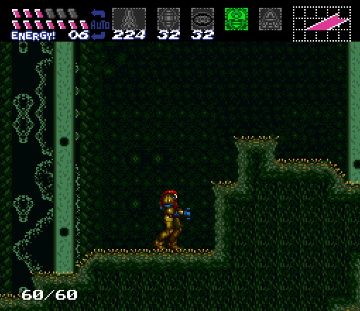
Some screenshots are outdated. The HUD is the perfect example of this.
The first image have the most recent HUD.
[img]http://i200.photobucket.com/albums/aa79/Green-Kirby/heatspike1.png[/im]
[img]http://i200.photobucket.com/albums/aa79/Green-Kirby/supermissile.png[/im]
[img]http://i200.photobucket.com/albums/aa79/Green-Kirby/awesome2.png[/ig]
[img]http://i200.photobucket.com/albums/aa79/Green-Kirby/areadone.png[/im]
[img]http://i200.photobucket.com/albums/aa79/Green-Kirby/sporespawn.png[/im]
[img]http://i200.photobucket.com/albums/aa79/Green-Kirby/hud-1.png[/im]
More info at later point...
That looks awesome!! O_O |
|
|
|
|
 Author


