 Author
|
Topic: Screenshots (Read 67867 times)
|
DarknessSavior
Guest
|
 |
« Reply #375 on: March 19, 2008, 07:21:14 am » |
|
Gee. I guess I should throw screenshots here more often. Apparently no one checks the personal projects subforum. The font I have there is from one of the font packs floating around: it was titled "Neo Rygar Font". That would explain why it looks like a Tecmo font: I'd imagine it was ripped from Rygar, and modified (and given a lower-case font). I modified it a bit (the l's and i's looked too much like the 1, so I thinned them out a bit and left the 1 nice and fat), but it's essentially the same. The attack names aren't final (really, nothing is). Once egg's done with the translations, Youji (my editor) and I will be going through it to try and make some sense out of them. If you guys like what I showed on those, check my project thread. There's a few more shots. I got into editing the map, and I got lucky: the bigger entries on the map were stored as tiles, so I got a psuedo-VWF effect going on. I still have to insert a font for the smaller entries and make a table for it, though. I'm more interested in finishing up Demon's Blazon, though, and since no one checks the personal projects thread:   8x16 font in action. ~DS |
|
|
|
|
FallenAngel2387
Guest
|
 |
« Reply #376 on: March 19, 2008, 07:45:18 am » |
|
that's because no one car...er... i mean...  seriously though, looks good, and it's nice to see a game with non-statistic based gameplay get translated now and then. not saying i got anything against rpgs/strategy, just nice to see something different. |
|
|
|
|
Guadozoku
Guest
|
 |
« Reply #377 on: March 19, 2008, 08:02:09 am » |
|
Gee. I guess I should throw screenshots here more often. Apparently no one checks the personal projects subforum.
Don't blame me. It's the first place I check when I come here. |
|
|
|
|
DarknessSavior
Guest
|
 |
« Reply #378 on: March 19, 2008, 08:21:24 am » |
|
Gee. I guess I should throw screenshots here more often. Apparently no one checks the personal projects subforum.
Don't blame me. It's the first place I check when I come here. Well, knowing is half the battle, as they say. I guess I'll post screenshots in here more often. >.> ~DS |
|
|
|
|
creaothceann
Guest
|
 |
« Reply #379 on: March 19, 2008, 02:10:18 pm » |
|
The m looks like an x ... apart from that it looks very nice. |
|
|
|
|
Gideon Zhi
Guest
|
 |
« Reply #380 on: March 19, 2008, 09:54:32 pm » |
|
DarknessSavior, you might want to be careful - typically, on most TVs, the leftmost and rightmost pixels of SNES games will not show up. They're hidden by overscan. Some of that may not show up perfectly when played on an actual system on a normal TV. (Specifically, the "r" in realms and the "d" in bathed.) Just a tip.
|
|
|
|
|
Crysta Blade
Guest
|
 |
« Reply #381 on: March 20, 2008, 04:57:30 am » |
|
It was suggested that I put a few screenshots from my latest project here. So I shall:
(snipped images) Romancing Saga, eh? Looks nice! The character sprites remind me of FF5. Not to mention a villian named 'BADBAD' (Well, I guess 'Badbad' now. Or 'BadBad?') It's Badbad now. Actually, when searching Japanese fansites, I found that he was called Badbad in the original.  To keep things on topic, here's a menu picture.  |
|
|
|
|
DarknessSavior
Guest
|
 |
« Reply #382 on: March 20, 2008, 03:17:53 pm » |
|
DarknessSavior, you might want to be careful - typically, on most TVs, the leftmost and rightmost pixels of SNES games will not show up. They're hidden by overscan. Some of that may not show up perfectly when played on an actual system on a normal TV. (Specifically, the "r" in realms and the "d" in bathed.) Just a tip.
Thanks. I'll keep that in mind, if I ever get the bloody thing working in expanded space. I just threw it together to see if the routine was broken or not. I still need to edit the font a bit too, make it match the palette of the old font. Edit: It was brought up in Ryusui's Breath of Fire II thread that the font in BoF GBA was ugly as hell, and it was out in the open. So I changed it.  - Original Font  - New font. Watchya think? ~DS |
|
|
|
« Last Edit: March 21, 2008, 07:08:17 am by DarknessSavior »
|
|
|
|
vivify93
Guest
|
 |
« Reply #383 on: March 21, 2008, 08:15:01 am » |
|
I'd say I beat you to it last year.   I asked Ryusui for his fonts, and he gladly obliged.  I haven't released it yet due to the following bugs:  (Numbers by level indicator cut off)   (The shadow gets grayed out with the white of the text) All of these bugs are the result of adding a shadow.  |
|
|
|
|
DarknessSavior
Guest
|
 |
« Reply #384 on: March 21, 2008, 08:38:02 am » |
|
Eh, I was just told about BoF GBA having a crappy font last week or so. So I did this last night.
Oh, and no bugs. =P
~DS
|
|
|
|
|
Talbain
Guest
|
 |
« Reply #385 on: March 22, 2008, 06:56:57 am » |
|
I'd say I beat you to it last year.   I asked Ryusui for his fonts, and he gladly obliged.  I haven't released it yet due to the following bugs:  (Numbers by level indicator cut off)   (The shadow gets grayed out with the white of the text) All of these bugs are the result of adding a shadow.  Curious but, is there any way to stuff more letters into some of those words so that the whole word can be seen? Somehow stuff like CHNG (rather than Change) is irritating for me to look at. |
|
|
|
|
DarknessSavior
Guest
|
 |
« Reply #386 on: March 22, 2008, 12:40:25 pm » |
|
Unfortunately, that's the way the game was. The game itself screams for a VWF and some menu editing, big time. Oh, and I decided to replace the 8x8 font too. The problem you had was indeed caused by adding a shadow to the 8x8 font. That's not how the original game stored it's font, so if you use that font, you'd have to change the game's code to be compatible with that type of font.    ~DS |
|
|
|
|
Vehek
Guest
|
 |
« Reply #387 on: March 22, 2008, 05:44:49 pm » |
|
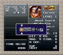
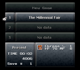
Today, I got the sixth letter in Chrono Trigger working in the sidebar and save menu.   Also in character select. Now all that's left should be getting it to show up in the battle menu. |
|
|
|
|
Gemini
Guest
|
 |
« Reply #388 on: March 22, 2008, 05:51:28 pm » |
|
Nice work. Too bad you can't store Silvird's (aka Epoch) name in 6 letters.  Unless you use some kind of gfx dte for "il". |
|
|
|
|
vivify93
Guest
|
 |
« Reply #389 on: March 22, 2008, 09:45:57 pm » |
|
Curious but, is there any way to stuff more letters into some of those words so that the whole word can be seen? Somehow stuff like CHNG (rather than Change) is irritating for me to look at.
There's enough room for 8-letter equipment names, 6-letter stackable item names (7 if you drop the "X" by "X#"), and 8-letter spell names, from what I've seen. The "STAT" and "OPTN" names have been changed because they're images in the game's data. If I had my way to change all the text, the options would be... Item Cast Arm Info Row (Because it changes your row) Swap (Because it lets you change characters) Opt. Save Exit Oh, and I decided to replace the 8x8 font too. The problem you had was indeed caused by adding a shadow to the 8x8 font. That's not how the original game stored it's font, so if you use that font, you'd have to change the game's code to be compatible with that type of font.
~DS
Yeah, but it looks better with a shadow, and those two bugs with the 8x8 font are the only ones I've encountered. So I will stay with the two bugs, just because it looks prettier.  |
|
|
|
|
|


 Author


 I haven't released it yet due to the following bugs:


