 Author
|
Topic: Screenshots (Read 67881 times)
|
Gemini
Guest
|
 |
« Reply #2370 on: September 05, 2011, 09:55:59 am » |
|
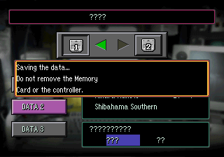
The 4 bit rendering code doesn't use any shades, it's just 2 colors: transparent and white. The 8 bit one, instead, uses a wide array of colors and can combine them with a colored shadow. Why they made it work like that is a mystery to me, but I'm guessing it's part of the issues they were having during the port from Saturn (which uses tiled BGs with different color configurations). As for the save screen:  Now I can say it: this 4bit VWF madness is finally over. |
|
|
|
|
I.S.T.
Guest
|
 |
« Reply #2371 on: September 05, 2011, 05:43:07 pm » |
|
  MMX Hack ^^ started it like a week ago almost done with the first level.  Anyone have the palette data for the title screen? Nice. |
|
|
|
|
Kagemusha
Guest
|
 |
« Reply #2372 on: September 06, 2011, 03:27:32 pm » |
|
 Anyone feel like doing graphic designs? Got a boatload of graphics/sprites that need to be hacked and that'll probably take the longest to do. |
|
|
|
|
Klonoa
Guest
|
 |
« Reply #2373 on: September 15, 2011, 02:57:40 pm » |
|
|
|
|
|
|
I.S.T.
Guest
|
 |
« Reply #2374 on: September 15, 2011, 04:02:10 pm » |
|
Nice work, dude!
|
|
|
|
|
reyvgm
Guest
|
 |
« Reply #2375 on: September 20, 2011, 12:31:41 pm » |
|
I can do that sphere for you pennywise. However, the most difficult thing for me is finding a suitable font. If you find a font you like, I'll do it.
|
|
|
|
|
Klonoa
Guest
|
 |
« Reply #2376 on: September 24, 2011, 09:53:36 pm » |
|
  TY Two more. |
|
|
|
|
MathOnNapkins
Guest
|
 |
« Reply #2377 on: September 25, 2011, 11:51:17 pm » |
|
Dabbling with a replacement font for Zelda ALTTP:  |
|
|
|
|
Neil
Guest
|
 |
« Reply #2378 on: September 26, 2011, 05:40:28 am » |
|
Dabbling with a replacement font for Zelda ALTTP:
allow me to be the first to say.. yuck.  |
|
|
|
|
MathOnNapkins
Guest
|
 |
« Reply #2379 on: September 26, 2011, 08:34:07 am » |
|
allow me to be the first to say.. yuck.  So did you have any constructive criticism tucked somewhere in that? |
|
|
|
|
Plint Michigan
Guest
|
 |
« Reply #2380 on: September 26, 2011, 02:09:53 pm » |
|
Dabbling with a replacement font for Zelda ALTTP:  I think it's cool. |
|
|
|
|
Neil
Guest
|
 |
« Reply #2381 on: September 26, 2011, 07:02:58 pm » |
|
So did you have any constructive criticism tucked somewhere in that?
Perhaps if there were some context to the font it would make more sense. It looks out of character for the game as I know it is all. |
|
|
|
|
DarknessSavior
Guest
|
 |
« Reply #2382 on: September 26, 2011, 08:53:38 pm » |
|
I agree with the context bit. I think it looks neat, but I reserve my full opinion until you show actual in-game shots of it in work.
~DS
|
|
|
|
|
satsu
Guest
|
 |
« Reply #2383 on: September 27, 2011, 12:48:46 pm » |
|
Dabbling with a replacement font for Zelda ALTTP:  The design looks pretty neat at first blush. However, while the individual letters look OK, when taken as a whole they don't seem to be designed consistently. Compare the B and D, which tilt clockwise, with the I and J, which tilt anticlockwise. There are some letters which don't appear tilted, like C and N. I think it'd be an improvement if this slight tilt was made somehow consistent. Also, I'd try and punch some holes in the interior shadows of that B if possible. |
|
|
|
|
MathOnNapkins
Guest
|
 |
« Reply #2384 on: September 27, 2011, 02:06:16 pm » |
|
The design looks pretty neat at first blush. However, while the individual letters look OK, when taken as a whole they don't seem to be designed consistently. Compare the B and D, which tilt clockwise, with the I and J, which tilt anticlockwise. There are some letters which don't appear tilted, like C and N. I think it'd be an improvement if this slight tilt was made somehow consistent.
Also, I'd try and punch some holes in the interior shadows of that B if possible.
Yeah, those are definitely good points. That was just my stopping point for the other night. I've since redone the upper case 'I' and 'J', and an IRC friend did a mockup based on this in a similar style, so I might steal and possibly modify his 'M' and 'N'. I didn't really like their current design much at all. The 'C' and 'G' probably wouldn't be too hard to add some tilt to, either. As for holes in the 'B' and 'A', I think I've found a way to do that that is pleasing enough to the eye. I haven't decided yet whether the font letters themselves will be 2 or 3 color, but if I want to do any sort of gradient backdrop stuff while other parts of the game are running (translucent rain, mist in the forest, I'm probably going to have to reserve that third color. (The 0th color being transparent). Edit: Latest version (ignore the 'H'):  |
|
|
|
« Last Edit: September 28, 2011, 11:25:37 pm by MathOnNapkins »
|
|
|
|
|
