+  RHDN Forum Archive
|-+  Romhacking
| |-+  General Romhacking
| | |-+  Titlescreens: Screenshots & Edits [Constructive Criticism Only]
Pages: 1 ... 35 36 [37] 38 39 40
Author Topic: Titlescreens: Screenshots & Edits [Constructive Criticism Only]  (Read 3 times)
KingMike
Guest
« Reply #540 on: September 08, 2009, 08:55:31 am »

Quote from: Recca on September 08, 2009, 12:04:19 am
(along with a "Patch not for sale!" like how it was done for Villgust.
Please no. That would be such an eyesore. Doubt it'd stop anything, either.
Recca
Guest
« Reply #541 on: September 08, 2009, 09:12:23 am »

I suppose you're right. Just having the fan translation group name on the title screen might be enough to make people think twice about trying to sell a patch. Seems that there was quite a problem with this in the 90s since a number of readmes used to have phrases along the lines on "Please do not sell this as I've worked very hard on it!". I mostly only see that on FAQs now a days. Heh, trying to sell something that can easily be found on the web... What cheap tactics to gain quick cash...
Kitsune Sniper
Guest
« Reply #542 on: September 19, 2009, 04:34:27 pm »

... It's been a while.

SNES original:


My new title screen:


Arcade original:

« Last Edit: September 19, 2009, 04:59:12 pm by Kitsune Sniper »
Tauwasser
Guest
« Reply #543 on: September 19, 2009, 04:46:03 pm »

Nicely looking Cheesy Now you just need to edit the tile map to display it properly Cheesy

cYa,

Tauwasser
Kitsune Sniper
Guest
« Reply #544 on: September 19, 2009, 04:49:55 pm »

Quote from: Tauwasser on September 19, 2009, 04:46:03 pm
Nicely looking Cheesy Now you just need to edit the tile map to display it properly Cheesy

cYa,

Tauwasser
... That IS the final version. The original title screen was more or less in the same spot.
Tauwasser
Guest
« Reply #545 on: September 19, 2009, 04:59:25 pm »

Oh, I thought it was a mockup. Nice work, then :thumbsup:

cYa,

Tauwasser
Kitsune Sniper
Guest
« Reply #546 on: September 19, 2009, 05:02:04 pm »

The mockup is exactly like the version in the game. I made the mockup and inserted it a few hours later. You can see the original image (before some extra tweaking) in the screenshots thread.
FlashPV
Guest
« Reply #547 on: September 24, 2009, 08:25:41 am »

Here's my first try for The Light Of Indra:
Jedi QuestMaster
Guest
« Reply #548 on: October 26, 2009, 03:07:48 am »

My version of the Contra title screen for the English hack:

mrspoon
Guest
« Reply #549 on: October 26, 2009, 05:44:26 am »

That looks really nice. I think it might look a little better with some additional fire in the 'C' though.
Jedi QuestMaster
Guest
« Reply #550 on: October 26, 2009, 11:53:40 am »

I guess it could. Undecided\
RedComet
Guest
« Reply #551 on: November 14, 2009, 02:18:35 pm »


I need someone to draw up something nice for the three lines of blue text at the bottom (copyright and such).

Here's the translation:

© Bird Studio / Shueisha
Fuji TV / Toei
© Bandai 1996

Widths for each line (height is 16 pixels):
1st: 136 pixels
2nd: 120 pixels
3rd: 112 pixels

Note: The above widths do not include the copyright symbol on the first and third lines. The copyright symbol is 16 pixels wide.

Really appreciate it. Smiley
Moulinoski
Guest
« Reply #552 on: November 20, 2009, 09:29:29 am »

Edit4: Here are my new versions... Again, not the same style, but I think they look good.


A cheap mock up (done in Paint!)


(For some reason, my images are coming out kinda icky here, but viewing the image alone, it's fine)

Edit5: DS told me I should try making each one the same height and to also do the copyright, so I'll do that later.

Edit6: I'll work on it on Sunday. I think I may be free then.
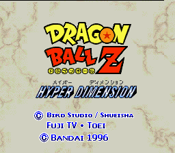

Old Bird Studio Shueisha
Old Fuji Tv
Old Bandai 1996

Well... I tried... :/

It's not the same style but that's because of the Shueisha logo. In Japanese, the size is all nice and dandy but Christ... It's long in English.

For the rest, I decided to go with the bunched together versions because of the Shueisha logo BUT I included a spaced out version of the two other fonts.

Hopefully it works well enough.

Edit: Wait... WTF... How'd I miss the part about copyright?! This is good!! *goes back to procrastinating schoolwork*

Edit2: Meh, even without the copyright in there, the Shueisha logo still doesn't fit with spaces in between...

Edit3: Wait, I think I has idea gais!
« Last Edit: November 20, 2009, 08:20:54 pm by Garoth Moulinoski »
Tauwasser
Guest
« Reply #553 on: November 21, 2009, 04:35:44 am »

Quote from: Tauwasser on September 19, 2009, 09:24:04 pm
東映動画 (とうえいどうが) -- Tōei Animations (as in animated film material, not Anime)

@OP: If you want to be totally correct (and possibly politically, too), you should add a Macron for Shūeisha (集英社) above the u as just shown.
Also, the studios -- for whatever reason -- usually go all caps when written in roman. Toriyama Akia's 「BIRD STUDIO」 is mentioned on his Wikipedia page.

Maybe that's a good option here since you use small capitals anyway? Also, is the problem the width of all these things, or what exactly? "Bird Studio/ Shueisha" does look like it would fit, so maybe just make the others the same height and center them and call it good?

cYa,

Tauwasser
Draken
Guest
« Reply #554 on: November 22, 2009, 08:15:22 pm »

Quote from: Draken on September 07, 2009, 11:49:31 pm


Bumpidee-bump!  I'm just wondering if anyone has been able to tackle this monster...?
Pages: 1 ... 35 36 [37] 38 39 40  


Powered by SMF 1.1.4 | SMF © 2006-2007, Simple Machines LLC