+  RHDN Forum Archive
|-+  Romhacking
| |-+  ROM Hacking Discussion
| | |-+  Nadia: Secret of Blue Water (Improvements)
Pages: [1]
Author Topic: Nadia: Secret of Blue Water (Improvements)  (Read 2 times)
Jedi QuestMaster
Guest
« on: December 17, 2009, 01:28:31 pm »

Seeing as there are problems with the translation from J2E, I was planning on retranslating this game from scratch.

But now I'm thinking of just trying to fix what's causing this problem:

Somewhere during the game, when a text pops up the palette starts to glitch up.  I'm pretty sure it has something to do with the text.  I'm not that advanced in romhacking, so any help is appreciated.

I'd rather not have to "reinvent" the wheel here. Shocked

Other changes I plan on making:

-title screen (make it look cooler)
-have in-game text resemble title screen text
-lose the J2E in the title (sorry, but a translator's job should be to make it look like no outside job was done to a game [even if it means not getting credit] Cry)
snark
Guest
« Reply #1 on: December 17, 2009, 01:34:54 pm »

what no tagginz?! >Smiley
kingofcrusher
Guest
« Reply #2 on: December 18, 2009, 04:47:26 pm »

LOL, yeah god forbid the guy who puts all the work into it try to get any credit.
Gideon Zhi
Guest
« Reply #3 on: December 18, 2009, 06:18:17 pm »

There are classy ways of adding credit and there are cheesy ways. Adding your logo to a title screen in such a manner as it stands out from all the rest of the stuff is cheesy. On the other hand, adding another line below the copyrights, in the same font so it stays natural-looking, is classy. Pasting on an intro with bouncy letters, bad chiptunes and greetz splattered all over the place is cheesy; adding a simple fade-in-fade-out logo that looks like it could belong to the original game? That's classy.
Ryusui
Guest
« Reply #4 on: December 18, 2009, 06:30:22 pm »

Quote from: Gideon Zhi on December 18, 2009, 06:18:17 pm
There are classy ways of adding credit and there are cheesy ways. Adding your logo to a title screen in such a manner as it stands out from all the rest of the stuff is cheesy. On the other hand, adding another line below the copyrights, in the same font so it stays natural-looking, is classy. Pasting on an intro with bouncy letters, bad chiptunes and greetz splattered all over the place is cheesy; adding a simple fade-in-fade-out logo that looks like it could belong to the original game? That's classy.

It's kinda funny to realize that d4s ultimately agreed with me that his "Team BoF2" logo was too cracktro-ish. The Watercrown Productions logo he ended up implementing was a bit fancier than what I would've done myself (check out the Sylvanian Melodies patch for how I would've done things), but it still works nicely.
Kitsune Sniper
Guest
« Reply #5 on: December 18, 2009, 09:06:16 pm »

I try to keep all translation credits as part of the end credits these days.

That's what I'm doing with Pizza Cats.
replicant1027
Guest
« Reply #6 on: September 16, 2010, 09:41:16 pm »

Quote from: Kitsune Sniper on December 18, 2009, 09:06:16 pm
That's what I'm doing with Pizza Cats.

Samurai Pizza Cats!! YAY!
Next gen Cowboy
Guest
« Reply #7 on: September 20, 2010, 10:14:12 am »

This thread's almost a year old, and you're responding to someone who doesn't even post here at the moment...
Jedi QuestMaster
Guest
« Reply #8 on: September 23, 2010, 02:59:09 am »

Hm.

I guess I'll use this thread to report on my status since it's conveniently on the the first page now.

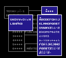
Nothing much, just replacing kana.  I'm making the rest of the english text out of the title screen fonts:


Let me know if any of the characters look weird to you.  I'm already planning on changing that 'T'
Jedi QuestMaster
Guest
« Reply #9 on: October 02, 2010, 02:43:47 am »

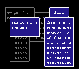
Finally finished with the table!


Let me know if it looks too cluttered.  I'll admit - it's a lot of characters for four spaces.

I might just decide to remove those two rows of accented letters.
Pages: [1]  


Powered by SMF 1.1.4 | SMF © 2006-2007, Simple Machines LLC