Vanya
Guest
|
 |
« Reply #840 on: November 03, 2008, 04:34:48 pm » |
|
First draft of new stage select screen:  Which one's better as far as the colors? This is the original palette:  This is the one made to look more like MM1 NES:  |
|
|
|
« Last Edit: November 04, 2008, 12:16:08 am by Vanya »
|
|
|
|
creaothceann
Guest
|
 |
« Reply #841 on: November 04, 2008, 05:29:39 am » |
|
"original palette" is a bit easier on the eyes, imo.
But maybe you can add both?
|
|
|
|
|
tc
Guest
|
 |
« Reply #842 on: November 04, 2008, 08:03:17 am » |
|
DQ3 is a prequel?  |
|
|
|
|
Nightcrawler
Guest
|
 |
« Reply #843 on: November 04, 2008, 08:18:09 am » |
|
Yes it is.
|
|
|
|
|
tc
Guest
|
 |
« Reply #844 on: November 04, 2008, 11:30:05 am » |
|
I vaguely recall an old issue of Nintendo Power talking about the three games, but don't remember anything about it.
|
|
|
|
|
Vanya
Guest
|
 |
« Reply #845 on: November 04, 2008, 04:47:09 pm » |
|
3rd Draft: I'm not doing the usual "STAGE SELECT" text because everyone should know that already.  |
|
|
|
|
Moulinoski
Guest
|
 |
« Reply #846 on: November 04, 2008, 06:23:58 pm » |
|
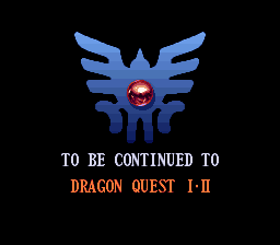
 End of presentation in debug menu (probably was presented to Yoji) "To Be Continued to"? Ignore me if you're aware of this but I believe it should be "To be Continued in..." Again, ignore me if you're aware of that. |
|
|
|
|
Gideon Zhi
Guest
|
 |
« Reply #847 on: November 04, 2008, 11:21:03 pm » |
|
My guess is that screen never got shown to the public - it's probably the end of some sort of press demonstration or other.
|
|
|
|
|
Vanya
Guest
|
 |
« Reply #848 on: November 06, 2008, 01:13:24 am » |
|
*4th Draft Version A:  *4th Draft Version B:  Which one's better? *Note - The 8 pixel column on the right won't be visible. |
|
|
|
|
Gideon Zhi
Guest
|
 |
« Reply #849 on: November 06, 2008, 01:48:20 am » |
|
I prefer version A, if only for symmetry reasons; B might be better if it was ALL black around the edges, outside of the big window sort of thing, but as it is it's going to feel slightly lopsided.
|
|
|
|
|
Kajitani-Eizan
Guest
|
 |
« Reply #850 on: November 06, 2008, 02:55:57 am » |
|
yeah, what's with the black border thing? should be symmetrical if possible.
|
|
|
|
|
Aeana
Guest
|
 |
« Reply #851 on: November 06, 2008, 03:12:55 am » |
|
Every NES screenshot I've ever taken with an emulator has had that black bar on the side. Like this and this. |
|
|
|
|
tc
Guest
|
 |
« Reply #852 on: November 06, 2008, 06:29:03 am » |
|
Mega Man 1 and 2 don't blank the left bar. Only 3 thru 6.
Few people know about this difference.
|
|
|
|
|
Naruto
Guest
|
 |
« Reply #853 on: November 06, 2008, 07:41:02 am » |
|
First draft of new stage select screen:  Which one's better as far as the colors? This is the original palette:  This is the one made to look more like MM1 NES:  I like the "First draft of new stage select screen" the best than two bottoms. I dont like two of them. The first one is better. |
|
|
|
|
Vanya
Guest
|
 |
« Reply #854 on: November 06, 2008, 12:22:03 pm » |
|
The screen shot thing is kind of irrelevant, but next time I'll edit out the 2 columns since they're not visible at run time.
Anyway, most ppl around the net seem to like draft 4B the most.
@Naruto: Why?
|
|
|
|
« Last Edit: November 06, 2008, 01:00:40 pm by Vanya »
|
|
|
|


