BRPXQZME
Guest
|
 |
« Reply #1410 on: October 30, 2009, 07:07:51 pm » |
|
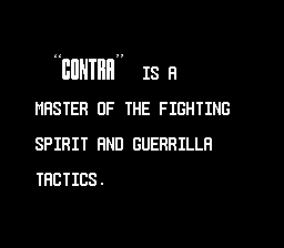
Within the constraints of looking like a bold version of that all-caps font , this is about as good as it gets:  The angles are a bit jarring, but the color is more important, IMHO. |
|
|
|
|
Jedi QuestMaster
Guest
|
 |
« Reply #1411 on: October 30, 2009, 07:09:17 pm » |
|
8x24  I don't want to make it look like an "H":  I like the way it looks all big & bold, as if it were quoted from Webster's.  Plus, it makes the rest of the caps really look small. Edit: Seeing as how the "CONTRA" characters are in their own tiles, I could probably make the "N" wider, taking up some of the other tiles. |
|
|
|
|
snark
Guest
|
 |
« Reply #1412 on: October 30, 2009, 07:26:09 pm » |
|
This one, I think is pleasing to the eye. The All caps have a good retro style in my opinion for this game. snark |
|
|
|
|
DarknessSavior
Guest
|
 |
« Reply #1413 on: October 30, 2009, 08:26:00 pm » |
|
*as Stewie* Blast! Damn you all! If you'd have agreed with me we wouldn't have all-caps! ._.
~DS
|
|
|
|
|
reyvgm
Guest
|
 |
« Reply #1414 on: October 30, 2009, 10:33:41 pm » |
|
Most NES games didn't have lowercase fonts, at least not most made by Konami and certainly not any Contra game. So using uppercase font for this translation goes with the NES style, Konami style and Contra style.
|
|
|
|
|
Tauwasser
Guest
|
 |
« Reply #1415 on: October 31, 2009, 07:59:40 am » |
|
Boom, Headshot  cYa, Tauwasser
|
|
|
|
|
Jedi QuestMaster
Guest
|
 |
« Reply #1416 on: October 31, 2009, 05:12:05 pm » |
|
Not familiar with the game but I think that font looks great! It's the Japanese version for Contra. I'm doing a new translation for it. Intro now done.    Oh and I do like this font. It's become a favorite of mine. How much work went into making room for the text? I don't much about ASM hacking.  |
|
|
|
|
Kagemusha
Guest
|
 |
« Reply #1417 on: October 31, 2009, 05:22:42 pm » |
|
That was a very easy hack. The game uses a table of sorts for the positions of every line. If you go beyond the number of lines, things will get a little wacky because the table didn't originally support extra lines. So I moved some of the tables and expanded them and it works like a charm. It was similar to just changing pointers
|
|
|
|
|
GenoBlast
Guest
|
 |
« Reply #1418 on: November 02, 2009, 01:44:34 pm » |
|
|
|
|
|
|
Celice
Guest
|
 |
« Reply #1419 on: November 02, 2009, 03:49:41 pm » |
|
I always wished the Picross boards would be numbered 16x16 for sprites to easily fit on  |
|
|
|
|
ded302
Guest
|
 |
« Reply #1420 on: November 16, 2009, 11:02:20 pm » |
|
Here is a screenshot of a Dte in Ninja Hoi.  |
|
|
|
|
KingMike
Guest
|
 |
« Reply #1421 on: November 16, 2009, 11:38:05 pm » |
|
I think it's actually "Ninjara Hoi!", but it looks good regardless.  (I know Gaijin called it Ninja Rahoi, but I noticed the ra is hiragana and hoi is katakana) |
|
|
|
|
ded302
Guest
|
 |
« Reply #1422 on: November 16, 2009, 11:50:41 pm » |
|
You're right about the games original name. Thanks for the comment.
|
|
|
|
|
Gemini
Guest
|
 |
« Reply #1423 on: November 17, 2009, 12:18:04 pm » |
|
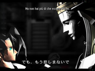
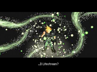
Translating these movies in FF7 is not just a fantasy anymore:   The second movie is running in hi-res. This is the real thing in memory. The soft subs are also applying a simple filter that removes completely the old subtitles with a simple DMA trick. Of course, the same trick was not applicable in Jenova's movie because it doesn't have any blank strip area, but it's not too bad as is. Many thanks to Kingcom for suggesting the idea of using vertical pixel impression. It's so much faster and allows bigger fonts. |
|
|
|
|
rmco2003
Guest
|
 |
« Reply #1424 on: November 17, 2009, 12:26:12 pm » |
|
very impressive - I wonder if we'll see an English retranslation using your tools in the future?
|
|
|
|
|
