 Author
|
Topic: GBA Graphics Help (updated) (Read 1 times)
|
Deets
Guest
|
 |
« on: October 02, 2009, 05:43:59 pm » |
|
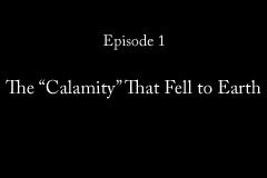
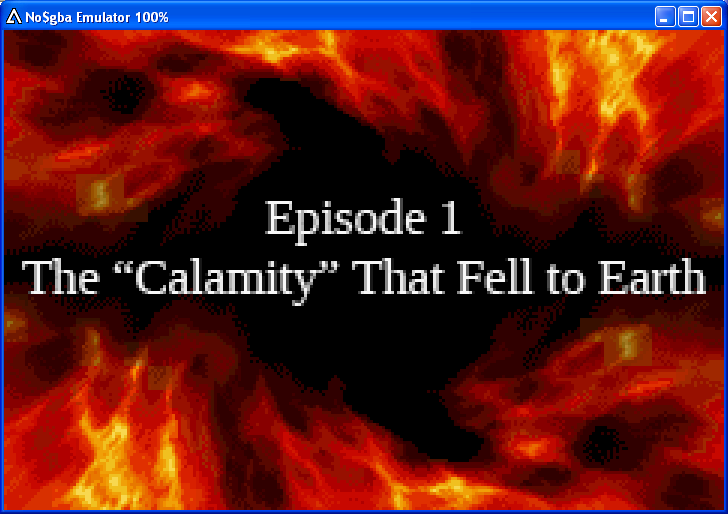
UpdatedNow that we're done with the episode titles, we have to deal with the little status graphics that pop up in the corners during attack animations. They look like this in their native form, and there are 30 in total:  We're unable to diverge from the source image in either color palette or dimensions, so I opted to recreate the gradient by hand, followed by drawing the letters manually and merging everything together to end up with the following:  I can't help but feel that I'm doing this in the most time-consuming and potentially inconsistent manner possible, and with a fairly ugly font, to boot. I guess what I'm wondering is: is there an easier way of doing this that doesn't require the hand-drawing of an entire font? A more attractive font would also be nice, but that's probably something I'll just have to experiment with on my own. I'm totally open to any suggestions you guys may have, though.
|
|
|
|
« Last Edit: October 07, 2009, 08:37:15 pm by Deets »
|
|
|
|
GenoBlast
Guest
|
 |
« Reply #1 on: October 02, 2009, 05:51:22 pm » |
|
I would try doing it on a transparent background, then reducing it to 16 colors. That way, the black outline should stay a black outline.
|
|
|
|
|
BRPXQZME
Guest
|
 |
« Reply #2 on: October 02, 2009, 06:13:10 pm » |
|
Basically, don’t let blue into the picture.
The Japanese version has a very thin outline. I’m not entirely sure they didn’t just make it as white text on a black background then set black to the alpha color.
|
|
|
|
|
Dragonsbrethren
Guest
|
 |
« Reply #3 on: October 02, 2009, 06:34:37 pm » |
|
Yeah, just do it on a black background, that should clear up the anti-aliasing problem. (I'm a bit surprised that this isn't common knowledge. I'm not talking about this specific case, but I've seen plenty of green/magenta outlines around graphics with transparency, even in official products. It would be almost unnoticeable if black had been used instead.) You could switch the background color to something else and remove all of the stray blue pixels by hand, but doing it on a black background and leaving the anti-aliasing will actually look a bit better.
|
|
|
|
|
Tauwasser
Guest
|
 |
« Reply #4 on: October 02, 2009, 07:43:09 pm » |
|
The real issue here is indeed that you don't use a transparent background so when you flatten the image, the colors will get mixed because of anti-aliasing. Transparency will have a color associated with it, even if you don't see it and even if the same color is used on the actual image. It shouldn't matter as long as you insert it properly so the same color index is the 0th index for the gba palette. EDIT: Ok, it took me a while, partly because I'm artistically retarded.  Basically, I used GIMP for all of it. - Create a new image with transparency and fill with transparency
- Write your text onto a text layer
- Create Path from text
- Do whatever you need to that to be an outline and fill it with solid black
- Chose appropriate background color
- Flatten image
- Change mode to indexed and reduce to 16 colors without dithering
The text above looks somewhat greyish/blurry because I had text hinting on off. I didn't like it without hinting, but it will make those greyish colors go away. I accidentally turned it off. cYa, Tauwasser |
|
|
|
« Last Edit: October 02, 2009, 09:04:50 pm by Tauwasser »
|
|
|
|
BRPXQZME
Guest
|
 |
« Reply #5 on: October 02, 2009, 08:06:43 pm » |
|
Erm... the entire point of hinting is to not have it blurry.
|
|
|
|
|
Tauwasser
Guest
|
 |
« Reply #6 on: October 02, 2009, 09:03:37 pm » |
|
Erm... the entire point of hinting is to not have it blurry.
I already said I'm artistically challenged... I turned hinting off, but then I Ctrl+Z'd it back while experimenting. So yes, this is without hinting. cYa, Tauwasser |
|
|
|
|
YuushaFan
Guest
|
 |
« Reply #7 on: October 02, 2009, 09:04:15 pm » |
|
 This is just a test, as I don't know how to set the alpha color or all that jazz, just supplying what I think it should look like if you use black at 16 colors. There's no opacity (again, I don't know how to get it set up so it looks like it should) either, just to let you know. |
|
|
|
|
Avatar_of_Chaos
Guest
|
 |
« Reply #8 on: October 03, 2009, 01:07:52 pm » |
|
umm....not to sound like an idiot but shouldn't the title say episode 2? or was the example picture of the japanese episode card just an example?
|
|
|
|
|
Ryusui
Guest
|
 |
« Reply #9 on: October 03, 2009, 01:21:08 pm » |
|
The Japanese card says "Destination Mars!", so yeah, it's just an example. On a random note, why is "Calamity" in quotation marks? You know that makes it sound like it's not really a calamity. http://www.hrwiki.org/mirror/bubs_bitetaken.mp3 |
|
|
|
|
Deets
Guest
|
 |
« Reply #10 on: October 03, 2009, 01:31:58 pm » |
|
On a random note, why is "Calamity" in quotation marks? You know that makes it sound like it's not really a calamity.
It's not really a bad thing, y'know? Like, when you're the whiny kid whose school gets demolished by an awesome robot, your initial thought is "that sucked," but then a couple weeks later you're like what the hell was I thinking man (this is coincidentally what happens in the game) It's that kind of "Calamity." Also thanks a lot for all the ideas, guys! We're uh, still trying stuff out. |
|
|
|
|
Avatar_of_Chaos
Guest
|
 |
« Reply #11 on: October 03, 2009, 02:29:16 pm » |
|
yeah fitting title for that stage...granted I don't blame that I mean come on Touya goes to school with Souske and Kouji.
|
|
|
|
|
Deets
Guest
|
 |
« Reply #12 on: October 03, 2009, 04:05:10 pm » |
|
 Awesome. Thanks a lot for the help, guys! The transparency suggestion worked like a charm.
October 07, 2009, 08:34:32 pm - (Auto Merged - Double Posts are not allowed before 7 days.)
Bump for changes to the first post. Go easy on me, okay :< |
|
|
|
« Last Edit: October 07, 2009, 08:34:32 pm by Deets »
|
|
|
|
|


 Author


