+  RHDN Forum Archive
|-+  Romhacking
| |-+  General Romhacking
| | |-+  Screenshots
Pages: 1 ... 91 92 [93] 94 95 ... 106
Author Topic: Screenshots  (Read 67861 times)
Dragonsbrethren
Guest
« Reply #1380 on: October 28, 2009, 03:18:40 pm »

Quote from: KingMike on October 28, 2009, 02:10:33 pm
Why not use the BoF2 (original translation) SNES 8x8 font?

That's really the SFC FF4 font?  Shocked
Because I would've guessed it was the Lufia 1 US 8x8 font. (I knew the uppercase/numbers were already plagiarizing, that is... if you can copyright a font?)

I think they're the same, actually. I wonder if the font actually came with the devkit or something; makes more sense than purposely ripping it off.
creaothceann
Guest
« Reply #1381 on: October 28, 2009, 04:50:22 pm »

Quote from: KingMike on October 28, 2009, 02:10:33 pm
that is... if you can copyright a font?

I'm sure game resources (e.g. MI1) are copyrighted, but "fair use" still applies.
BRPXQZME
Guest
« Reply #1382 on: October 28, 2009, 05:10:31 pm »

Quote from: KingMike on October 28, 2009, 02:10:33 pm
if you can copyright a font?
The legal situation is weird and sticky, varying from country to country.
vivify93
Guest
« Reply #1383 on: October 28, 2009, 07:24:00 pm »

Quote
The default 8x8 font in FFIV looks like crap.
I beg to differ, else I wouldn't be using it.

Quote
If you're going to do that, use the normal FF 8x8 font,
I thought about doing that, but I thought it would look off in the game.

Quote
or the FF Advance font (that you can find in the RHDN font archive).
I pretty much know this font by heart. At any rate, that'd be an issue. I can't add a shadow or a gray psuedo-outline, else the font will look wonky when it grays out "CHNG" in battle before you get Gobi with the rest of your team.

Quote
Or, if you want a good 8x8 font from a Japanese game, I suggest Estpolis (Lufia) II. It has a great looking default 8x8 font.
I could just use my modification of that font, but I'm tired of using it in every other game. I could also use the EarthBound Zero font; I rather like it.

Quote
Why not use the BoF2 (original translation) SNES 8x8 font?
Because it looked like crap. Also, that's what was used in the original GBA version of BoFI.

Quote
I think they're the same, actually.
FFIV J:


LI US:


Anyway, what I really wanna do is edit some of the horrendous menu text in the game. I dunno how I can though; most of it looks to be compressed or something. None of it's in ASCII at least.
« Last Edit: October 28, 2009, 07:34:56 pm by vivify93 »
Moulinoski
Guest
« Reply #1384 on: October 28, 2009, 07:27:24 pm »

Quote from: green-kirby on October 28, 2009, 01:20:22 pm
Quote from: Garoth Moulinoski on October 28, 2009, 10:18:56 am
Wait, so does that mean you'll put easier enemies later on or you'll just keep encountering the same enemies over and over again?
No... ^.^;

More like, you can go and fight harder enemies early on in the game as it's much more open... Or you can explore the areas with easier enemies first! Tongue

Oh!

Okay, so it's kinda like Dragon Quest... As in, you'd know you're not supposed to be somewhere if you keep getting killed somewhere (AKA passing the wrong bridge).

Well, if it's like that, then I guess it's fine.
Deets
Guest
« Reply #1385 on: October 29, 2009, 08:39:33 pm »

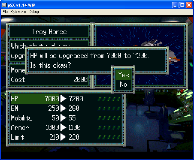
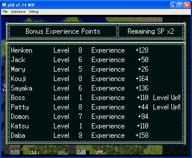
Some big ol' Super Robot Wars F screenshots


snesmaster40
Guest
« Reply #1386 on: October 29, 2009, 09:03:39 pm »

The font is just perfect. I'm guessing the script hasn't been edited yet? (Katsu)
Deets
Guest
« Reply #1387 on: October 29, 2009, 09:07:37 pm »

Yeah, just did some quick editing of weapon names and the like; everything else is on the backburner until I'm out of things to do with J. The bottom-right screenshot is from real route mission 1, which is the only actual dialogue I've actually done anything to so far.
« Last Edit: October 29, 2009, 10:43:14 pm by Deets »
Kagemusha
Guest
« Reply #1388 on: October 29, 2009, 10:10:27 pm »


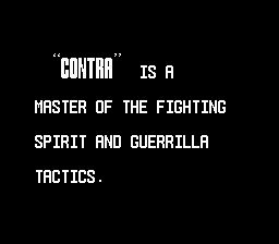
My hack for this part of the game ended up being much easier than I'd thought it'd be. Almost there and I suppose Toma's font doesn't fit Contra style-wise?
reyvgm
Guest
« Reply #1389 on: October 29, 2009, 10:18:36 pm »

I know you probably want to hear that yes, the fonts you picked are perfect. But in this case, it's not.
The real Contra experience comes with the all uppercase font Konami used for 99% of their NES games Smiley
Jedi QuestMaster
Guest
« Reply #1390 on: October 30, 2009, 01:01:25 am »

I'm sure you're going to like this then, Rey:


But the "N" doesn't look right no matter what I do to it. Undecided\
Moulinoski
Guest
« Reply #1391 on: October 30, 2009, 09:59:26 am »

Quote from: Deets on October 29, 2009, 08:39:33 pm
Some big ol' Super Robot Wars F screenshots
[img]http://shonic.net/images/temp2/premission.png[img]

O_O I didn't think this getting worked on too much yet. Awesome stuff! Can't wait to try it out!
Gemini
Guest
« Reply #1392 on: October 30, 2009, 11:43:51 am »

Quote from: Deets on October 29, 2009, 08:39:33 pm
Even if I'm not a fan of S-RPGs, I've got to say: SEXY!
reyvgm
Guest
« Reply #1393 on: October 30, 2009, 11:47:35 am »

Quote from: Jedi QuestMaster on October 30, 2009, 01:01:25 am
I'm sure you're going to like this then, Rey:


But the "N" doesn't look right no matter what I do to it. Undecided\

I liked the original one you made better.
But the N will never look good in the amount of horizontal pixels you are using. You need to make it wider.
GenoBlast
Guest
« Reply #1394 on: October 30, 2009, 11:58:39 am »

How about:
Pages: 1 ... 91 92 [93] 94 95 ... 106  


Powered by SMF 1.1.4 | SMF © 2006-2007, Simple Machines LLC