 Author
|
Topic: Screenshots (Read 67867 times)
|
RedComet
Guest
|
 |
« Reply #1215 on: July 26, 2009, 04:30:43 pm » |
|
Off topic but did anyone else misread that as "Praise To The Great Fiery Vagina" at first or was it just me? :huh:
|
|
|
|
|
aishsha
Guest
|
 |
« Reply #1216 on: July 26, 2009, 04:34:30 pm » |
|
Off topic but did anyone else misread that as "Praise To The Great Fiery Vagina" at first or was it just me? :huh:
You are not alone (c) :laugh: |
|
|
|
|
Kagemusha
Guest
|
 |
« Reply #1217 on: July 26, 2009, 05:50:03 pm » |
|
Well dirty minds think alike  Seriously, this is purely psychological similar to ink blots. I could see the relevance if I removed the "ra", but this is just a case of your mind seeing what it wants to see. Perhaps you should satisfy your desires  |
|
|
|
|
BRPXQZME
Guest
|
 |
« Reply #1218 on: July 26, 2009, 11:05:49 pm » |
|
I reiterate that I would’ve left it untranslated. About as many Japanese people can read Siddham as Westerners can read blackletter (or even 18th/19th century cursive for that matter).
|
|
|
|
|
Tauwasser
Guest
|
 |
« Reply #1219 on: July 26, 2009, 11:34:31 pm » |
|
I reiterate that I would’ve left it untranslated. About as many Japanese people can read Siddham as Westerners can read blackletter (or even 18th/19th century cursive for that matter).
+1. If you really want to translate it, you could always have its original in place and just anime the English to go right to left (like on a news ticker) above it. I think it's quite ugly and hard to read this way. cYa, Tauwasser |
|
|
|
|
snark
Guest
|
 |
« Reply #1220 on: July 26, 2009, 11:40:00 pm » |
|
N
O
E
Z
.
.
.
|
|
|
|
|
Next gen Cowboy
Guest
|
 |
« Reply #1221 on: July 27, 2009, 12:20:15 am » |
|
 *whistles* You know I love it! |
|
|
|
|
DarknessSavior
Guest
|
 |
« Reply #1222 on: July 27, 2009, 12:34:24 am » |
|
Hell is that? The Mega-ten strategy RPG?
~DS
|
|
|
|
|
Carnivol
Guest
|
 |
« Reply #1223 on: July 27, 2009, 04:10:36 am » |
|
 *whistles* Not sure what I'm looking at (but "I like"), but hope you don't mind me picking on the r in your font a little bit. I think it looks a little bit... like an italic v, or something. Dunno if it's 'cause of the angle of the front of it, 'cause it's only 3 pixels wide (while most other letters appears to be 4-5) Anyway, did a quick mock up with a slightly altered r.  (probably a few other things that could be nitpicked on, but it'd require too much font-redesign work to do something about, I suppose.) |
|
|
|
|
GenoBlast
Guest
|
 |
« Reply #1224 on: July 27, 2009, 04:51:20 am » |
|
Hell is that? The Mega-ten strategy RPG? Majin Tensei. Your r doesn't match the style of the font.  \ |
|
|
|
|
Carnivol
Guest
|
 |
« Reply #1225 on: July 27, 2009, 08:04:18 am » |
|
Your r doesn't match the style of the font.  \ There is a style? Anyway, looking over what's in that picture, everything, sans the V, do blunt 90' or single pixel angle/directional changes and operates on 2/3 vertical lines (where the 3 is where you have most full horizontal lines, such as what's found in the e, a and s (but not f), and the 2s are where you find all angular changes, such as the top of the a, n and e.) But, yeah, simplified: notice the way the rounding off on the top of the e, n and a is done, then compare that to my r and the previous r. Sorry about the wonky way of explaining it. I'd doodle a chart/explanation on a paper or something if I wasn't so lazy :laugh: Maybe there's just something I'm just not seeing in the font (while seeing a whole lot of other stuff), if there is some sort of overall style going on that makes the current r fit in... ('cause, well, to me, it stands out, a lot! Like some sort hybrid v/y/r thing) |
|
|
|
|
RadioShadow
Guest
|
 |
« Reply #1226 on: July 27, 2009, 08:53:28 am » |
|
 *whistles* I don't like that font. Might be because of the size of the screenshot but I find it hard to read the text with that font. Or its just me. *shrugs*  Just got to add the remaining map offsets and the readme. |
|
|
|
« Last Edit: July 27, 2009, 03:04:05 pm by RadioShadow »
|
|
|
|
Gideon Zhi
Guest
|
 |
« Reply #1227 on: July 27, 2009, 08:48:17 pm » |
|
 *whistles* I don't like that font. Might be because of the size of the screenshot but I find it hard to read the text with that font. Or its just me. *shrugs* Font is the same font I used in SMT1. It's staying like that for continuity purposes. Sorry :/ |
|
|
|
|
Kajitani-Eizan
Guest
|
 |
« Reply #1228 on: July 28, 2009, 03:13:11 pm » |
|
yep, that r doesn't fit the style of the font. kind of in a good way, though, because the font is kinda... ugh. it's really big, really wide, and really robot looking, which is not at all well served by the zero interline spacing. all of that it makes it really hard to read.
|
|
|
|
|
RedComet
Guest
|
 |
« Reply #1229 on: August 05, 2009, 01:31:01 am » |
|
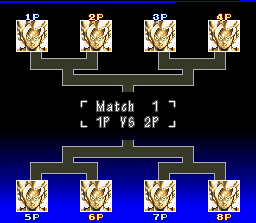
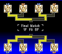
  You have no idea how much of a pain in the ass those were to get working correctly. I'm really proud of myself. :laugh: One more screen to hack and then I can get the script ready for editing. Woo. |
|
|
|
|
|
 Author