

Attic full of older things
(dust covered boxes of tiny springs?)
posted by on Sunday April 17, 2005 at 7:57PM (EST)
This is where I'll be posting links to my older sites (nothing pre-ximwix). Maybe I'll add nostalgic thoughts along with them. Maybe some psd files and stuff, too. Maybe not.
(dust covered boxes of tiny springs?)
posted by on Sunday April 17, 2005 at 7:57PM (EST)
This is where I'll be posting links to my older sites (nothing pre-ximwix). Maybe I'll add nostalgic thoughts along with them. Maybe some psd files and stuff, too. Maybe not.
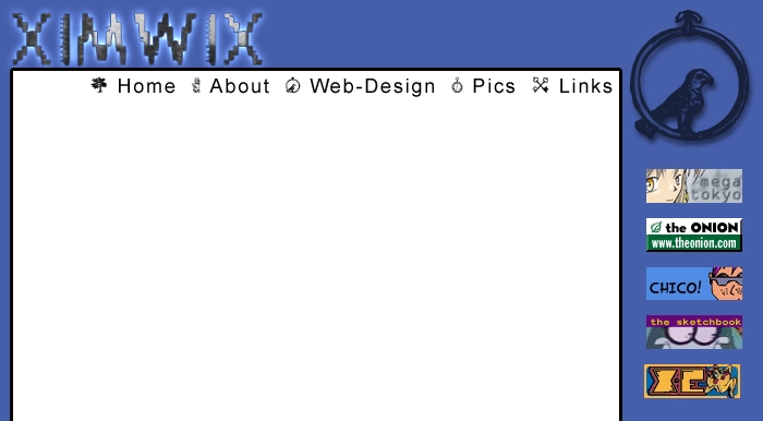
Design 1
(around June 2002)
posted by Ugly Joe on Saturday April 23, 2004 at 8:47pm (EST)
This was my very first attempt at throwing together a design for ximwix. This was only shortly after I had decided to use ximwix as the name for my site. I had the created the word a month or two earlier, but didn't know what to do with it. It came down to either this, or a band name. Since I figured I'll probably never be in a band (except for a few rehearsals and small tour as the vocalist for "The Horribles"), this was the only other choice. I still wasn't sure what I was going to do with it, even. A blog, for sure, but I had no idea what else. I forget if I had already gotten my dad to buy me the domain name and web space yet when I worked on this one. I probably did since the Design 2 was the first design that I used, and that was definately developed with php/mysql in place.
Anyway, the design is pretty simple: Logo, nav bar, links, big open space for text. Honestly, I haven't progressed too much from that point, I'm just better at making it look like something else. My idea, for whatever reason, was to use the glyphs from Mellon Collie and the Infinite Sadness' lyrics book in the design. Basically, each section would be represented by a different glyph. Nothing too far out there, just stupid because the glyphs have absolutely nothing to do with the sections that they would be representing (though, to be fair, I can't draw too many connections with the glyphs and the songs they're supposed to represent, either...). I had probably just discovered that Smashing Pumpkins Wingdings font and was ansy to use it for something.
Another thing you should probably notice is that this was right around when I figured out how to use the layer filters in PhotoShop. Notice the drop shadow on the glyph and the amalgamation of outer glows, borders, and texture fills that make up the logo. I like to think I've grown out of that stage (the only one I really use anymore is border).
This was also during my link button phase. I'm not sure why I was using them. Oh, wait, yes I do. They look like content. I'm horrible at incorporating images into a design, so these were an easy way to mix up the color scheme a bit and flesh out an otherwise flat design. I still find it hard to do. I'm always afraid that it will end up looking like random clip-art in the middle of a document. I believe my link button phase died when half of the sites that I linked to died. That, and nobody could get the dimensions right. 88 wide by 31 tall, people, it's not too hard to figure out.
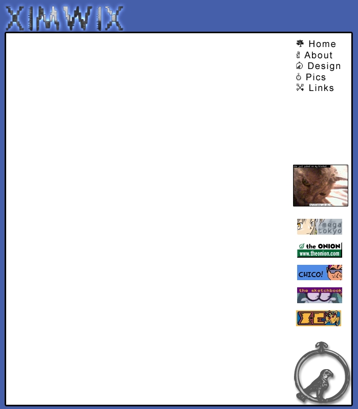
There is also the Design 1b. This one was a small rework of the first one, which by this point I had, more or less, given up on. This was a last ditch effor to save it. Did I mention it didn't work? The only thing I did to change was push the glyph to the bottom of the page and add a webcam image (which is of my now dead cat, Marble). I looked around the psd of this one and saw that I had another layer where I had placed the navigation in the upper right blue area. If I were working with this now, that would have been enough to save it for me. Move the nav up top, scrap the link buttons and cam, and then play with fonts until the big white area looks like it's being properly utilized. I guess I didn't think of that back then.
If I recall correctly, the main reason I didn't like this design was because it reminded me way too much of the design X-Entertainment had at the time (this was before they became so ad-ridden). A fair reason, I think.
(around June 2002)
posted by Ugly Joe on Saturday April 23, 2004 at 8:47pm (EST)
This was my very first attempt at throwing together a design for ximwix. This was only shortly after I had decided to use ximwix as the name for my site. I had the created the word a month or two earlier, but didn't know what to do with it. It came down to either this, or a band name. Since I figured I'll probably never be in a band (except for a few rehearsals and small tour as the vocalist for "The Horribles"), this was the only other choice. I still wasn't sure what I was going to do with it, even. A blog, for sure, but I had no idea what else. I forget if I had already gotten my dad to buy me the domain name and web space yet when I worked on this one. I probably did since the Design 2 was the first design that I used, and that was definately developed with php/mysql in place.
Anyway, the design is pretty simple: Logo, nav bar, links, big open space for text. Honestly, I haven't progressed too much from that point, I'm just better at making it look like something else. My idea, for whatever reason, was to use the glyphs from Mellon Collie and the Infinite Sadness' lyrics book in the design. Basically, each section would be represented by a different glyph. Nothing too far out there, just stupid because the glyphs have absolutely nothing to do with the sections that they would be representing (though, to be fair, I can't draw too many connections with the glyphs and the songs they're supposed to represent, either...). I had probably just discovered that Smashing Pumpkins Wingdings font and was ansy to use it for something.
Another thing you should probably notice is that this was right around when I figured out how to use the layer filters in PhotoShop. Notice the drop shadow on the glyph and the amalgamation of outer glows, borders, and texture fills that make up the logo. I like to think I've grown out of that stage (the only one I really use anymore is border).
This was also during my link button phase. I'm not sure why I was using them. Oh, wait, yes I do. They look like content. I'm horrible at incorporating images into a design, so these were an easy way to mix up the color scheme a bit and flesh out an otherwise flat design. I still find it hard to do. I'm always afraid that it will end up looking like random clip-art in the middle of a document. I believe my link button phase died when half of the sites that I linked to died. That, and nobody could get the dimensions right. 88 wide by 31 tall, people, it's not too hard to figure out.
There is also the Design 1b. This one was a small rework of the first one, which by this point I had, more or less, given up on. This was a last ditch effor to save it. Did I mention it didn't work? The only thing I did to change was push the glyph to the bottom of the page and add a webcam image (which is of my now dead cat, Marble). I looked around the psd of this one and saw that I had another layer where I had placed the navigation in the upper right blue area. If I were working with this now, that would have been enough to save it for me. Move the nav up top, scrap the link buttons and cam, and then play with fonts until the big white area looks like it's being properly utilized. I guess I didn't think of that back then.
If I recall correctly, the main reason I didn't like this design was because it reminded me way too much of the design X-Entertainment had at the time (this was before they became so ad-ridden). A fair reason, I think.
copyright, etc
everything on this site is mine and not yours. if you bother to steal from me, at least give a link back. Also, and , yo. You ain't fat, you ain't nothin'.
everything on this site is mine and not yours. if you bother to steal from me, at least give a link back. Also, and , yo. You ain't fat, you ain't nothin'.